The design process for a high performance home in the forests of Southern Vermont
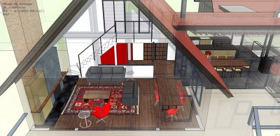
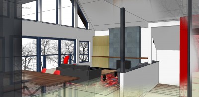
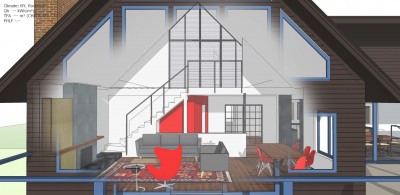
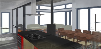
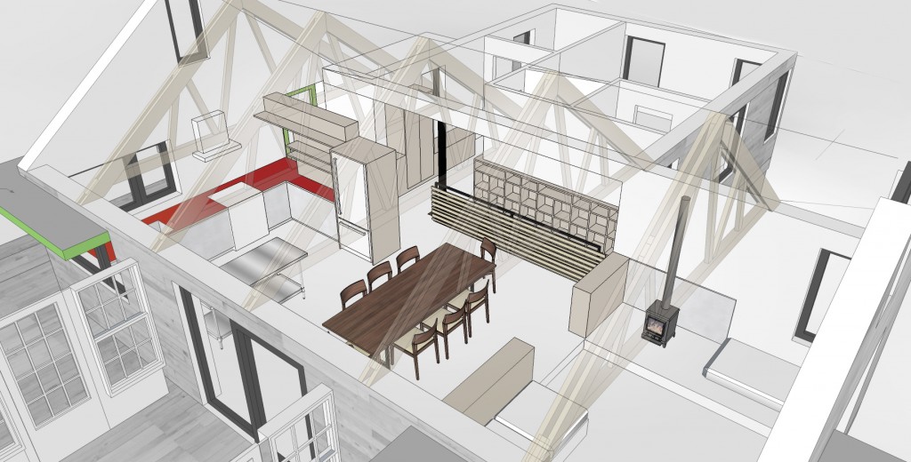
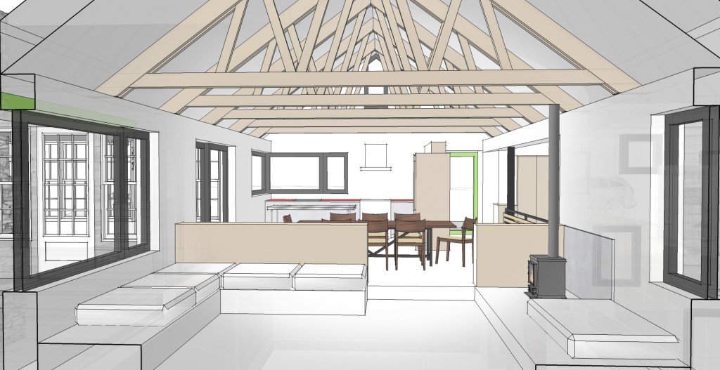
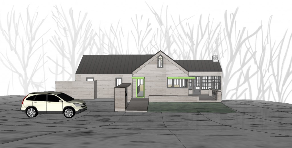
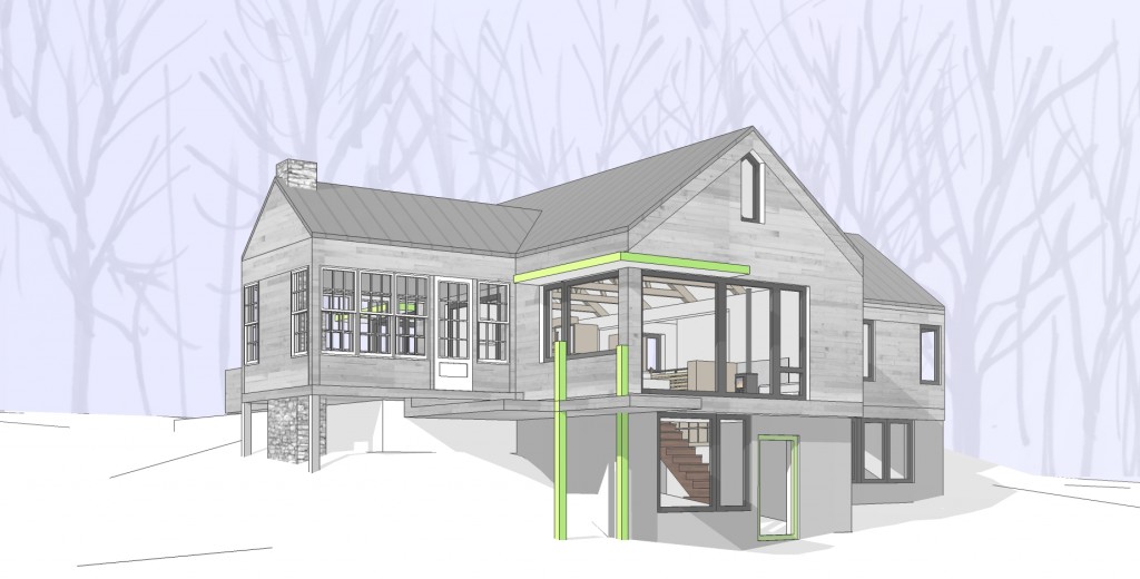
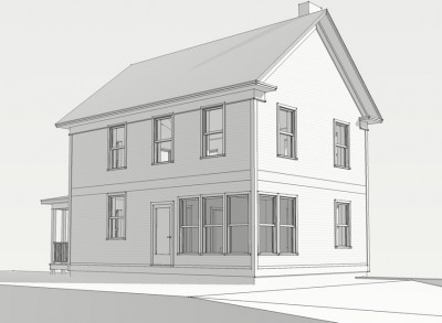
Church Project - initial renderings
Greenfield project update
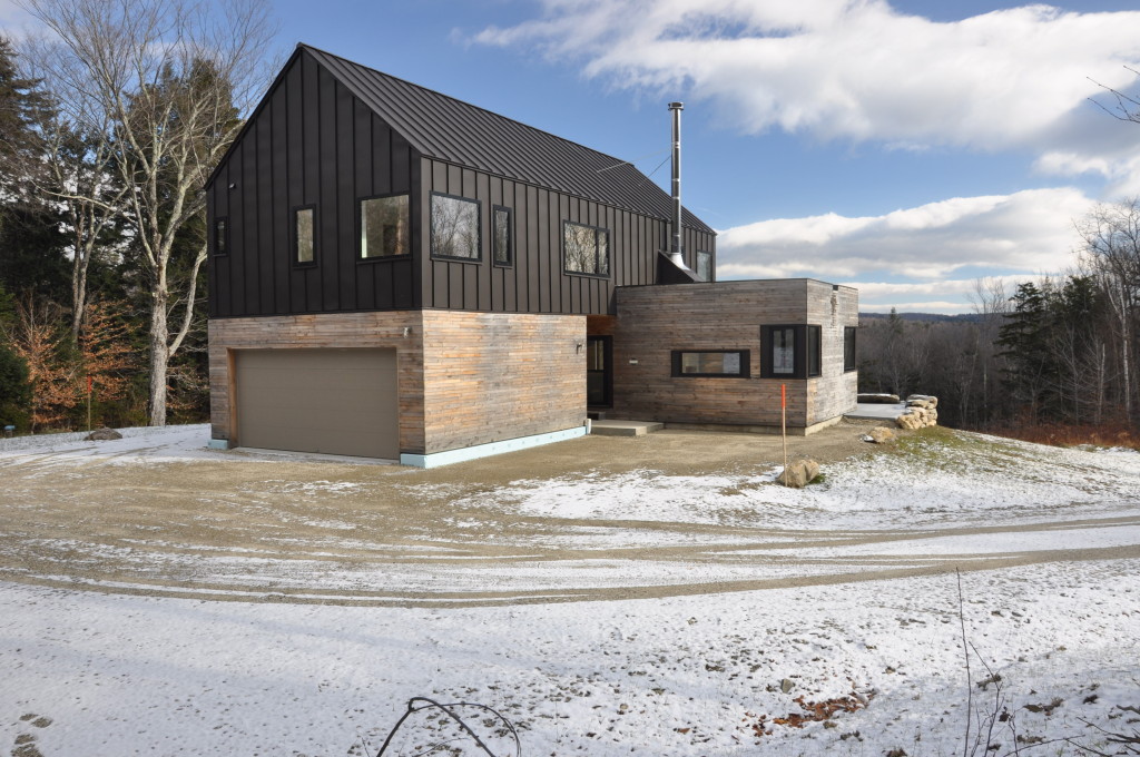
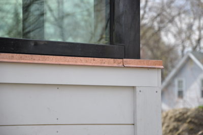
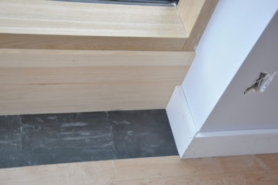
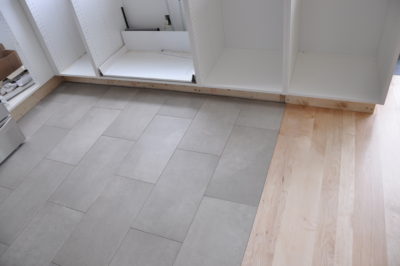
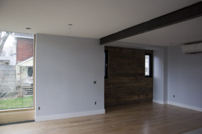
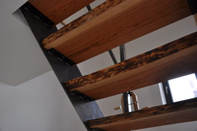
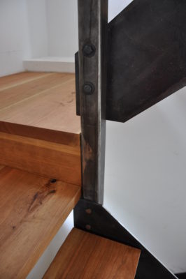
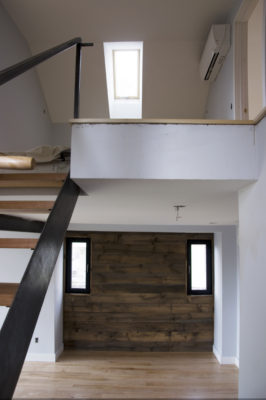
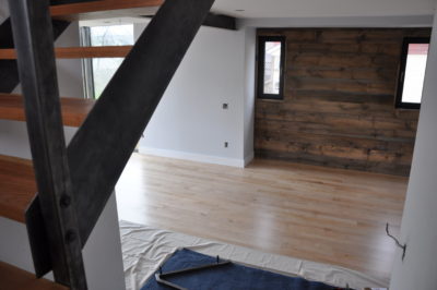
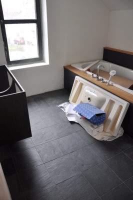
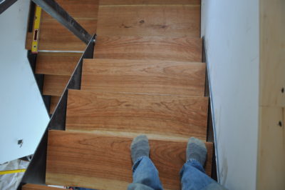
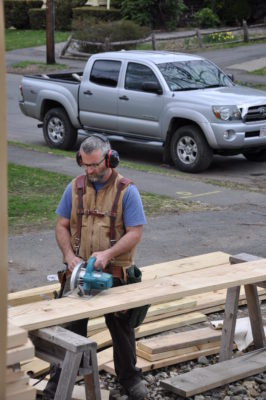
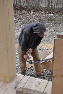
I have a lot of photos from the Greenfield project. I am spending a fair amount of time on site working out details with the builder. I strongly feel that this is the way it should be. Things never translate perfectly from paper to built form no matter how much detail and specificity I put into a set of construction documents and on this project, I am spending much time on site figuring things out and detailing to a higher level. I think Chad, the builder, appreciates this process and I'm finding that it hearkens back to my pre-architect design build days. I hope to do more projects with this level of involvement in the future. I really think that this is "the way to go" here are lots of photos. Note the local wood use: Cherry stair treads with "live" edge, local maple flooring downstairs and pine upstairs, Vermont slate, and a wall sheathed with weathered pine off my own land.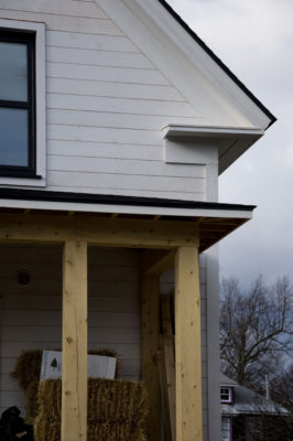
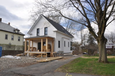
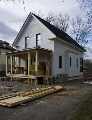
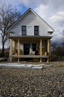
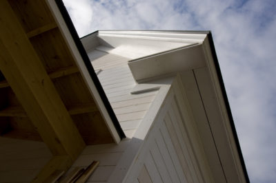
Hemlock - Open Gap Rain Screen Siding
My use of eastern hemlock as a siding material has been generating interest. Hemlock is a common wood in Vermont but doesn’t get used a lot except in barns and outbuildings and sometimes for timber frames. My summer job during high school involved working in a small sawmill. We sometimes cut hemlock and I found the wood beautiful, but heavy. One summer, we cut some hemlock for a bridge. Fast forward um… lots of years and I ordered a bunch of hemlock for framing and decking when I built my barn. I learned a bit about how to work with hemlock, how it ages and weathers and I started thinking about how I could use it in my own work. I try to source materials as locally as possible and design within local builder's abilities and interests - which is easy to do here where builders get together monthly to discuss building science related issues

In rural New England, buildings are often sided with pine siding in a vertical shiplap form – and often unfinished. It tends to develop a black mold that is relatively harmless but can be ugly. I found that hemlock is more resistant to this mold. It’s also harder and more rot resistant. It is nowhere near as rot resistant as cedar, a more common siding material however.
White pine siding on my own barn

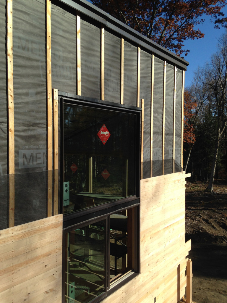
A brief on open rainscreen siding: Good architect and builders are installing siding with a vented airspace between the siding and weather resistant barrier (WRB). This allows any moisture that gets behind the siding to dry out before it does damage. Modern materials (a better WRB) and the venting detail allow us to use different materials and different details for the siding itself. I have commonly seen the open gapped rainscreen detail used with ipe boards but Ipe is a tropical hardwood related to mahogany. Cement based boards are also used commonly but cement has fairly high embodied energy. Both of these are not locally sourced materials. The gap in the siding also reveals a view of the WRB (depending on the size of the gap) This means that damaging UV rays are also reaching the WRB. And bugs. Thus the need for a better (and black) WRB. There are several on the market designed for this. Both projects shown here use Mento and tapes from Foursevenfive.com
It occurred to me that I could use narrow hemlock boards from local mills to create a very elegant (I hoped) rainscreen siding detail. It would use local and relatively inexpensive materials, it wouldn’t need paint or stain, installation could be simpler and faster if I got the details right, and if I installed it horizontally, the lowest courses could easily be replaced if the siding degraded due to splashback and snow banks. The damaged siding would not present a disposal concern – just toss it in the bushes and it becomes habitat for red backed salamanders. I was lucky to have a client with a taste for modernism allow me to try my ideas out on his home. The results were rather spectacular and gave me a sense of the potential. Now I am doing my second project with hemlock siding. The builders for this project (Webster Construction of Marlboro, Vermont) are quite familiar with good building science and modern products and methods. They saw the potential and were happy to give it a try plus they were able to improve my detailing in several ways which I can then incorporate into drawings and specifications for the next time around.
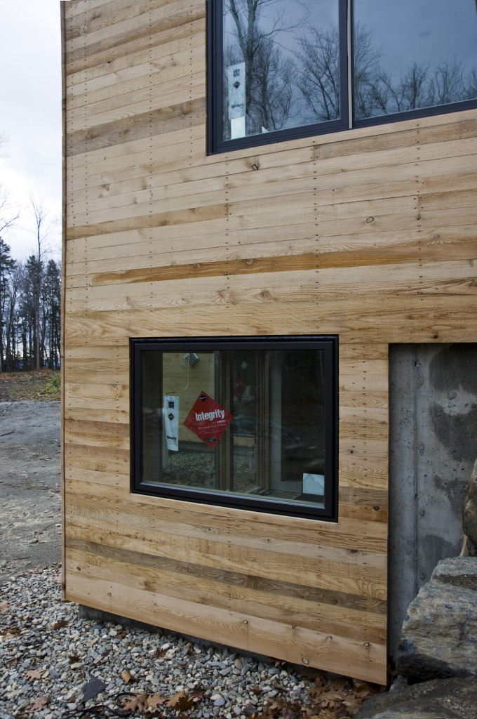
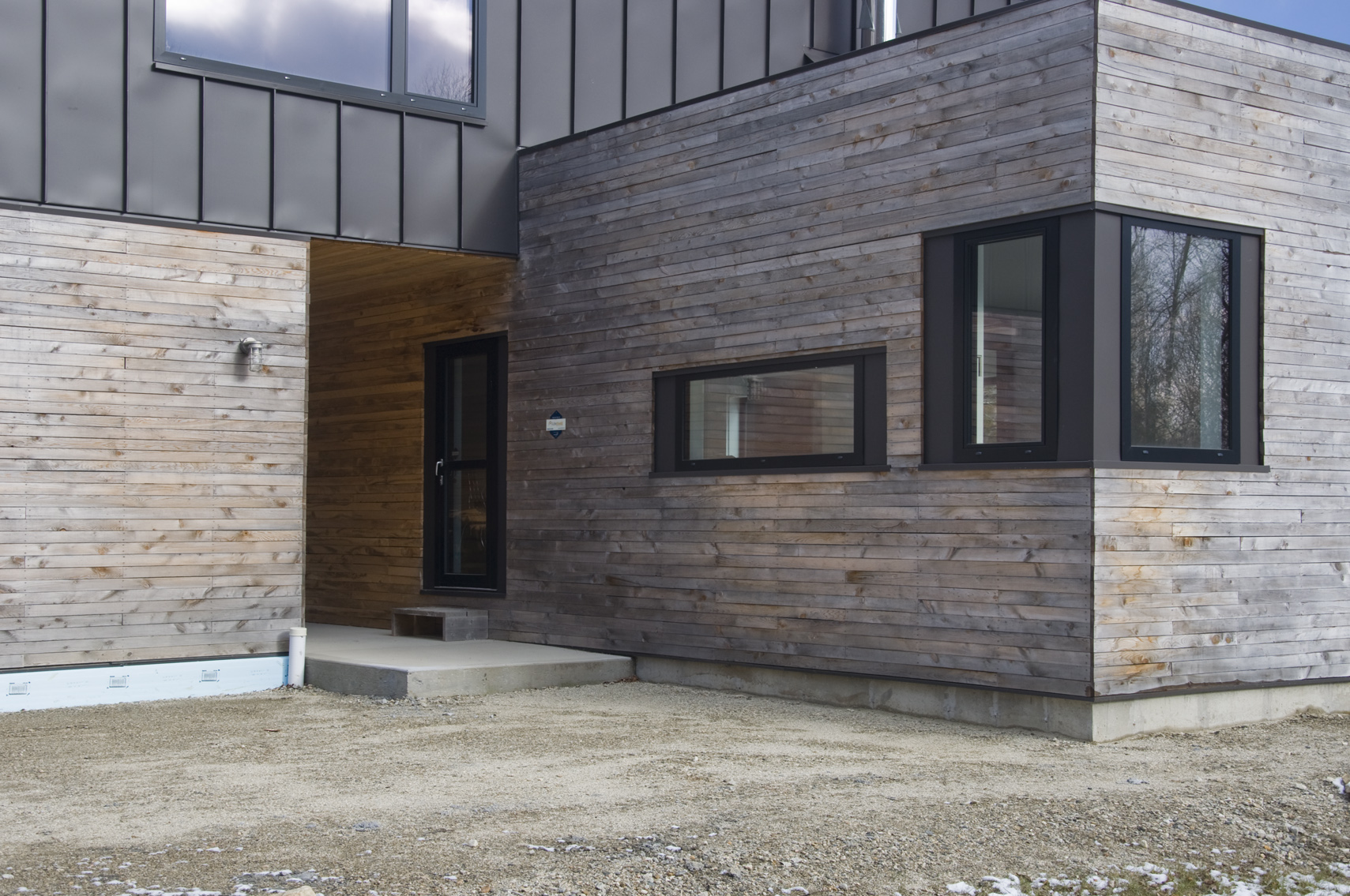
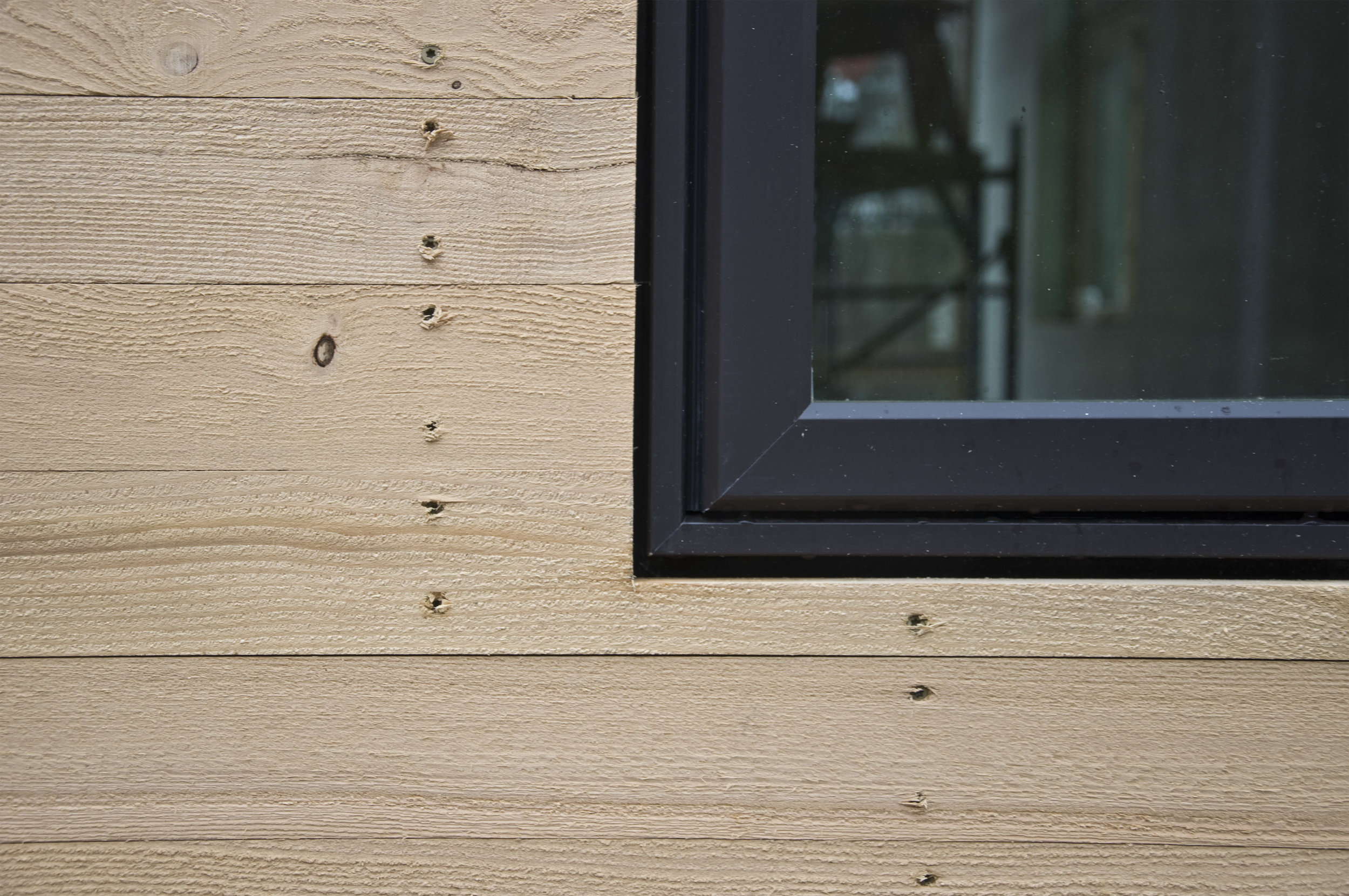
The hemlock turns silvery gray within a year. The narrow boards create a woven, fabric-like aesthetic.
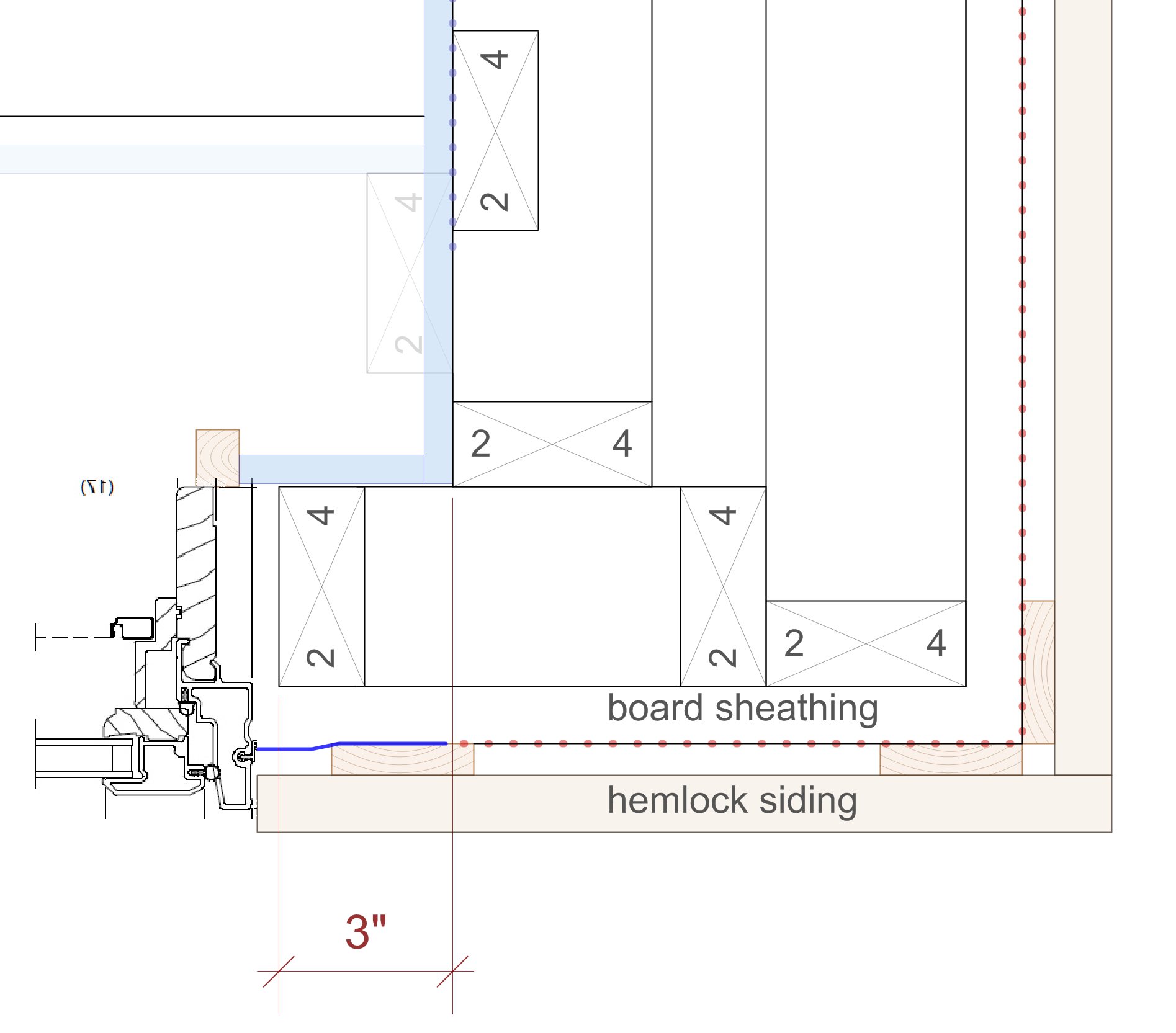
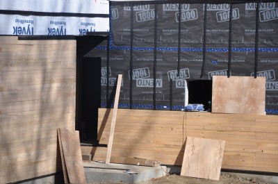
The hemlock is installed "green" with deck screws. This siding is all 1x3 so gaps will be quite small as the wood dries. Fiberglass bugscreen is installed directly behind the siding. strapping can be regular 1x3 strapping although coravent makes an excellent product for this purpose and should at least be used on any strapping set horizontally such as over and under windows.
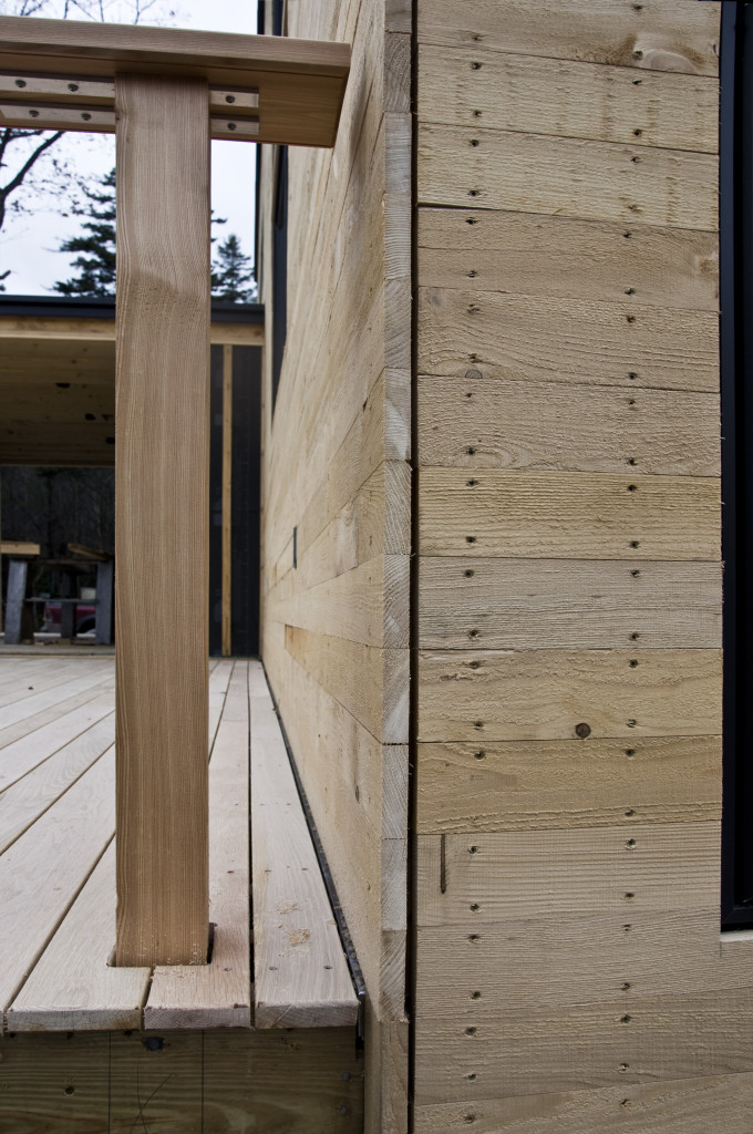
This is the corner trim detail the builder came up with and I really like. One side runs long and is cut after installation. The other side is held back for a crisp reveal - very architecty! Of note: the deck is white oak (local) and the post is European Larch which is from a harvest of a Vermont tree farm. European larch is used in Europe as a durable siding material that needs no treatment.
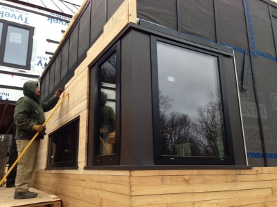
detailing around windows is super simple. On the first house I used metal panels (installed by the roofer) to accentuate the windows and wrap corners. Here it is about as simple as it gets.
Early Thoughts on the Greenfield Project (architect)
I took a shot at writing down my own thoughts about the Greenfield project I’m doing for my wife’s folks. Sometimes I have so many half-baked ideas in my head that writing them down creates a jelling effect and helps me to clarify and focus my efforts. I’m planning on documenting this project to a much higher level than I have in the past, partly because we are assembling something of a dream team to get this done and partly because I am using this project to redefine how I work in order to bring my own practice to a higher level. I have encouraged the others to start writing as well and some of that will show up here on the blog as well for a more well-rounded perspective. We are currently exploring the feasibility of doing this house as a Passive house and seeking certification. I hope, as usual, to show what can be accomplished when a highly functional and customized plan is also an emotionally uplifting place to live. This projects continues my exploration into the emotional aspects of “home” and how to use architecture to augment and reinforce the emotional connection to place. Phew! What have I to gain from doing this project as a full-on Certified Passive House? So what if the winter heating bills drop from $75/month to $25/month? Is that really worth all the extra effort and expense to go through certification? We don’t know the answer to that yet. “Let me run some numbers” as the engineer or accountant would say. Passive house has cache. It attracts media. There is huge marketing potential. The clients (my in-laws) are understandably interested in that aspect of it - it relates to their son-in-law’s ability to financially support his wife and children. I want to do more of this type of work in the future and will I ever get such a good opportunity to gain exposure, attention and build a reputation that to do a very attractive and relevant project at this highest level… and market it to the greatest extent possible. I have seen that model propel other firms into the limelight so I am aware of what power and potential in inherent in this thinking. Otherwise- My own limited knowledge of Passive House indicated that this house as designed thus far could attain Passive House certification with minimal extra effort. I’m a Certified Passive House Designer – CPHD with the international credential but I have little practical experience. This project could be a great way to gain that experience. The most effort and extra money will probably be in soft costs – hiring someone with experience to do the energy modeling, advise on detailing and assist in the certification process. With this project we are also formalizing a fairly progressive project delivery process that I am realizing is crucial to creating high performance buildings. This represents the direction my own business model is headed in. I have, in the past, followed both the more traditional architect route where I work with clients to design and detail a project and we shop it out to builders. I have also worked (more often) in a more design-build model where the builder is integrated into the process from very early in the process. That has been my preferred method of project delivery but I am realizing that to provide the highest levels of service, I need to fill in some gaps. I can’t do everything and I don’t have expertise in everything so I’m bringing in people to help fill the traditional gaps. Subcontractors as well need to be on board as part of the team at a much earlier stage and need to be aware that they will be asked to perform at a very high level of professionalism. Part of my job is to make that as easy as possible for them through design and detailing. I am working on this project with Mel Baiser of Baiser Construction Management and Chad Mathrani of Vermont Natural Homes both of whom have training in passive house detailing and construction. They understand what it takes to reach that highest level of building excellence. And considerable enthusiasm to do so. We are pouring over the details as fast as I can draw them up to insure that no stone is left unturned. The process requires a high level of integration at this early stage in terms of product selection, integrated assembly, cost (and relative costs). Assumptions are challenged and vetted and everything will be put down on paper before the project is staked out on the site which is under considerable snow at the moment. We will maintain a process blog as part of Vermont Architect to provide a window into this process. Blog readers and Bluetime Collaborative facebook followers have already seen some early schematic design images of this project. Stay tuned.
Mod Ski Home in VT - interiors
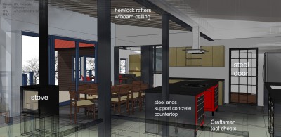
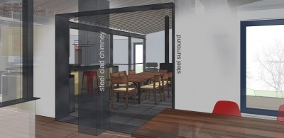
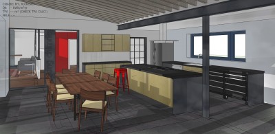
I'm working on fleshing out the interiors for this addition renovation project here in Vermont.
G-Jan-4 from Robert Swinburne on Vimeo.
Education of an Architect('s wife)
The Day I Became a Modernist—Guest Post by the Architect's Wife There was a time in my life when I would not have uttered the word “modernist” without an accompanying sneer. My aesthetic tastes then ran toward the…dilapidated. If it was old with a sagging roof, I liked it. Bonus points if it looked like it might fall over any minute. I loved dark little stone cottages that probably had little light and abundant mildew inside.
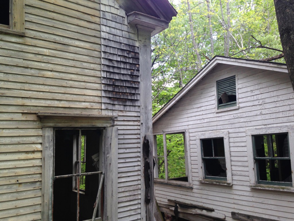 No Bob - maybe more like this:
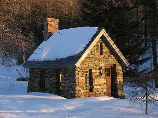 but crappier - ed.
When I was a child visiting my grandparents in Chicago, I was bored to tears by the Frank Lloyd Wright tour.
Then I met Bob. Who will describe how he was moved to tears the first time he saw Falling Water.
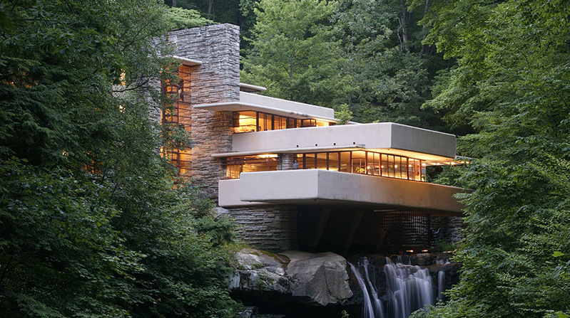
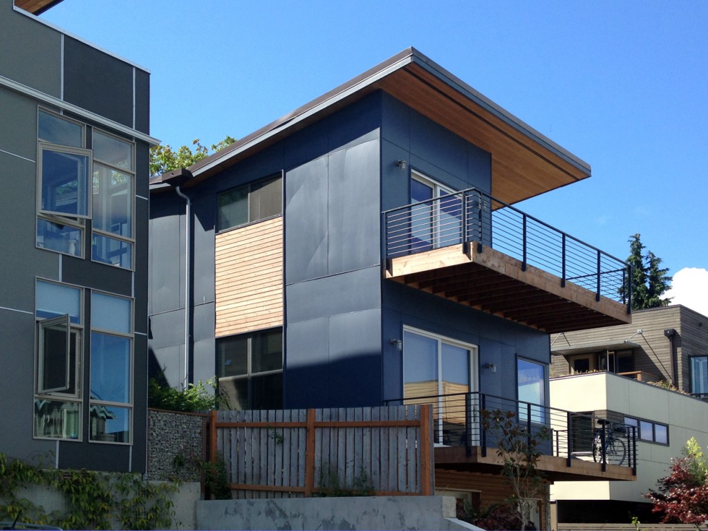
Gradually, from listening to him talk I began to be more open-minded. I realized that much of what I had derided was not actually modernist, but rather the post-modern stucco’d bland that was the hallmark of the late ‘80s gentrification during my teenage years in Seattle. Under Bob’s tutelage, I developed an appreciation for the concept of modernism as something that embraced clean simplicity, elegance in minimalism, form in the service of function. But I still didn’t really like it.
The other thing for which Bob helped me develop an appreciation was bicycling. I had not owned a bike since the one I had at age 8 that had pedal brakes and a coveted banana seat. But since he was an avid cyclist, I got a basic mountain bike and began learning some technical skills for riding the trails. I loved riding but rolled my eyes when he would wax eloquent about sleek steel or clean joints or carbon fiber. To Bob, a well-made bicycle is a work of art.
About a year and a half into our dating, Bob and I took a trip out West to Seattle (my childhood home), Portland and Northern California. Since one of Bob’s favorite pastimes was (is) visiting bike shops to ogle the merchandise, we stopped at a large shop in Portland. After forty minutes or so I was feeling glazed and wandered to a different part of the shop.
And there, at the end of an aisle, I saw it. It was titanium. It was sleek. It was retro. For the first time, I could understand the urge to hang a bicycle above the mantle. The angels were still singing when Bob found me staring slack-jawed at the Merlin Newsboy. If I recall, he nodded patiently with a knowing smile as I sputtered about how beautiful and perfect it was. That Christmas, he got me a Merlin decal as a joke (the actual bicycle was a limited edition with a price tag something on the order of $3500, and didn’t come in my size frame anyway).
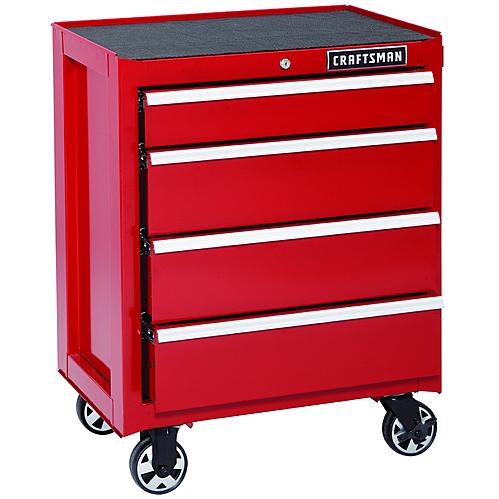
By the following Christmas after that, we had gotten married and bought our home together. Browsing through the tool department at Sears, the angels sang for me a second time. Bright red, ball-bearing Craftsman cabinets. Those drawers feel downright sexy, how smoothly they open and close. Open-close, open-close I went as Bob looked at table saws or something. And all I could think was : kitchen utensils!!
So I guess that sort of clinched me as a modernist. And I even like the buildings now, too (I challenge anyone to not love weathered core-ten steel cladding).

I suppose fifteen years of living with Bob has rubbed off on me. But I still love dilapidated, too.
Scandinavian influence in Vermont
AmesHill October29 from Robert Swinburne on Vimeo.
This one will have a bit of a rustic Scandinavian feel to it. And be super-insulated of course.
Progress on Mod ski home in Vermont
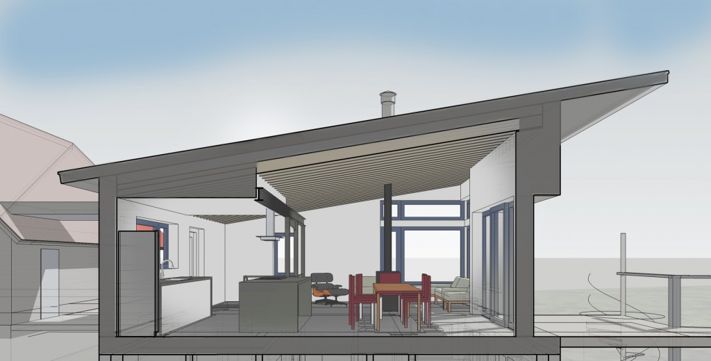
One of the projects I'm working on is an addition to and renovations of a ski home in Vermont. The main house is well built and and other than a maroon and pink bathroom and rather 80's finishes, we are not doing anything too major to it.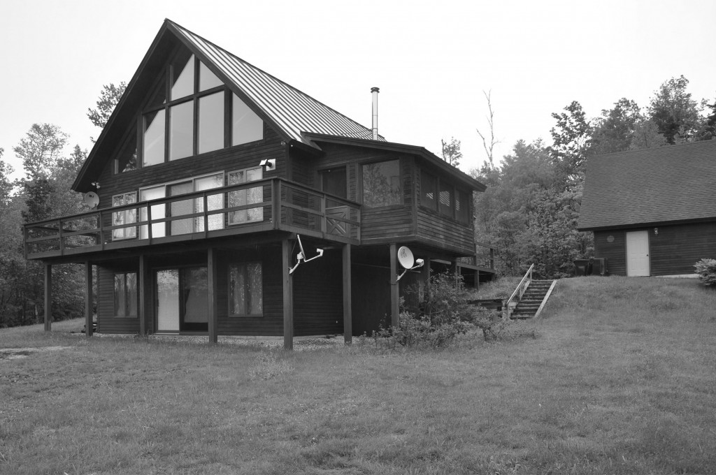 We are locating a family room addition between the existing house and garage which will provide a much nicer kitchen and living area plus additional bunkrooms and a multi-user bath on the basement level. I'm sticking with the dark clapboard and red standing seam roof of the existing as I think it provides a nice base for some fun things to happen with color at the doors and windows.
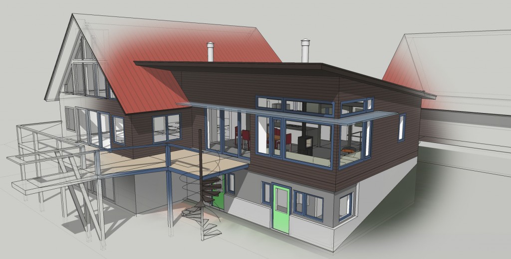
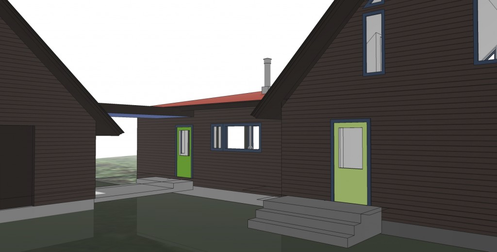
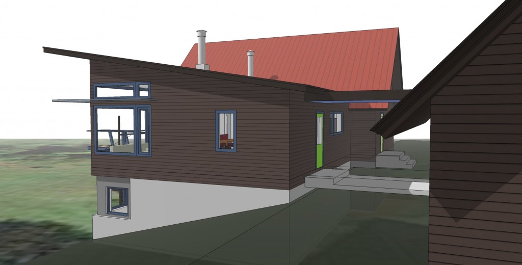
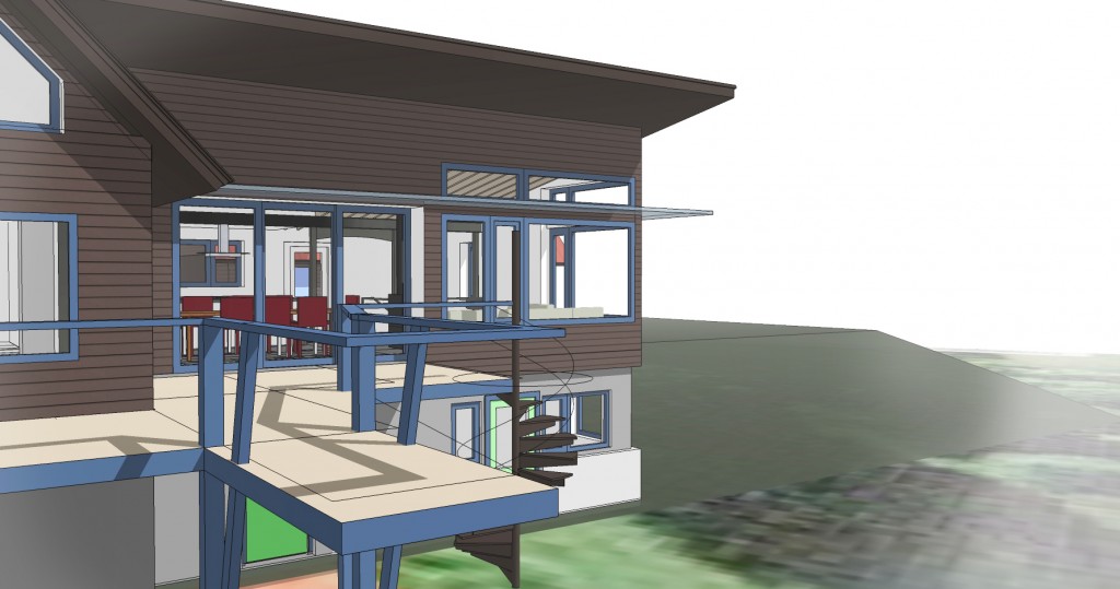
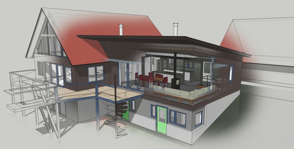 I am using big windows, wood, steel etc to create a warm, modern and relaxed space for lots of people to be in.
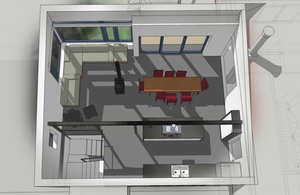
 Here is the current plan:
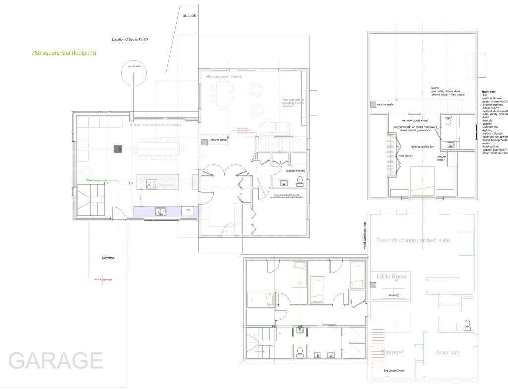 and I put together a few videos of the sketchup model
Miscellaneous Musings
I am working on this new small greek revival in Maine. Not the high style Greek Revival with huge columns like you see on banks and government buildings but the small, simple style that is so ubiquitous in New England and doesn't get much attention but everybody knows. I'm designing it to "pretty good house" standards. It is for a family member who lost her house in a fire- we'll see how the budget goes and if the details get watered down as is often the case. She has always loved the Greek Revival look which is more often done wrong than right it seems. I used this sketchup model to push and pull and play with trim and proportion to get it right. I have found that often the frieze board (the wide flat board at the top of the siding under the eaves) often gets shortchanged when the builder frames the house including window openings then discovers that he doesn't have enough room for a properly proportioned frieze.

In any design there is always a lot of back and forth on windows - what works inside may not be so great on the outside etc. so I use the model to really fine tune it in terms of balance, rhythm, symmetry/asymmetry (exterior aesthetics) and light, cross ventilation, views, sun and solar gain, the feel of the room, (function and interior aesthetics)
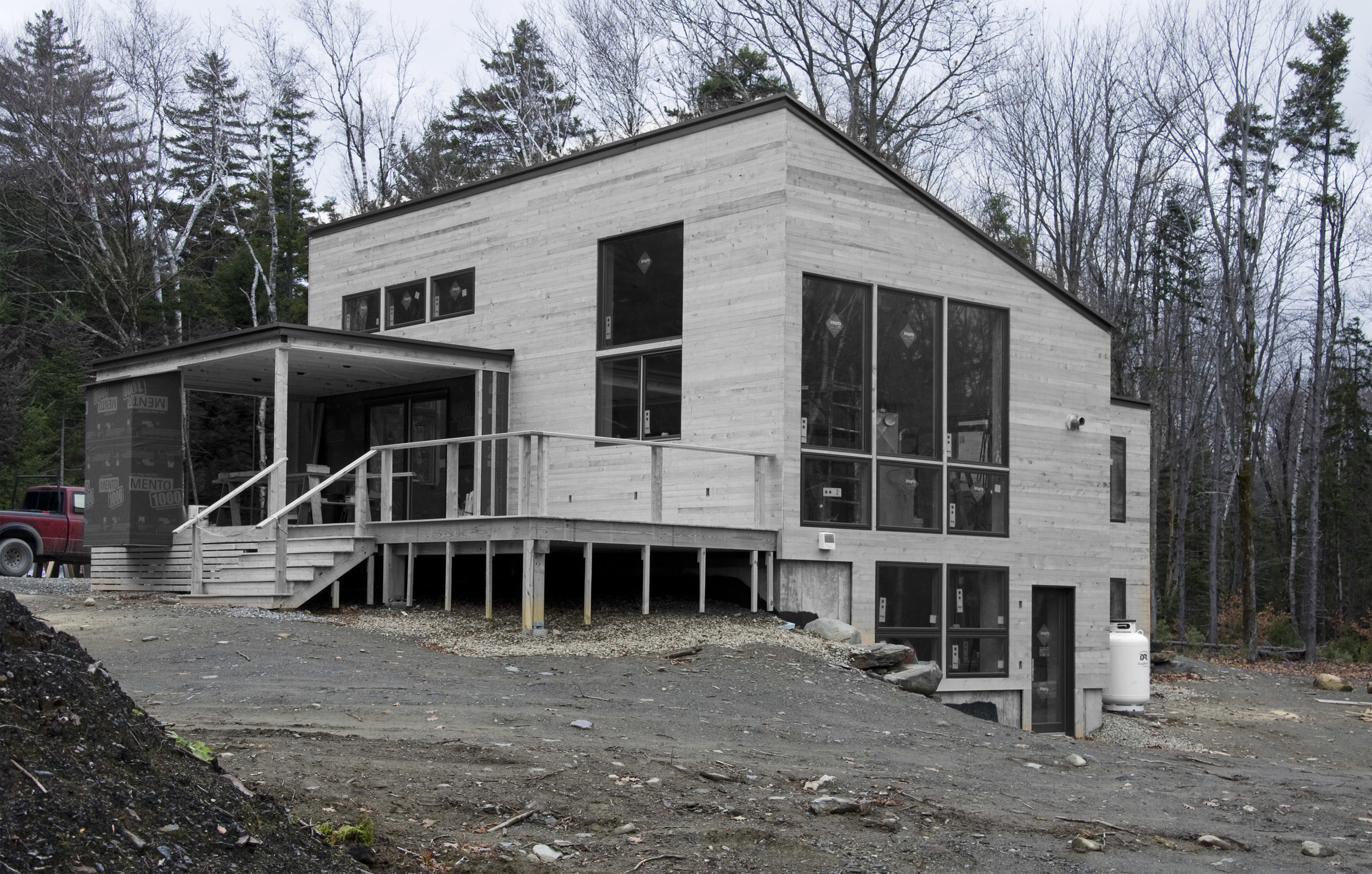
This is very different from this house which is currently under construction in Vermont which is also a "Pretty Good House" although nearly to the Passive House with Unilux triple glazed windows from Germany But with a modern aesthetic and some really beautiful spaces and materials. We are using raw green 1 x 3 hemlock from a local mill at siding over coravent strapping (rain screen detail) and Mento 1000 weather barrier. The hemlock will dry in place, turn grey and gap in a rougher version of open joint siding often created with Ipe or cedar siding.
I am also studying and reviewing the first three days of Passive House training. The next three days are coming up next week. I am learning a lot of building science stuff that will improve the level of design and service I am able to provide - whether or not I ever get to work on a certified passive house. It was disconcerting, however, to ride the bus into Boston past thousands upon thousands of older houses and housing stock that is rather the opposite of Passive House in terms of energy usage and all the other metrics. You get the feeling of "what's the point". Is passive house a just another trophy for someone building a new house to attain and meaningless in terms of saving ourselves from the coming death, doom and destruction of climate change? I am looking at it in terms of simply building better houses and not thinking about saving the world.
"No matter how many times you save the world, it always manages to get back in jeopardy again. Sometimes I just want it to stay saved, you know? " - Mr Incredible.
Green Hemlock Siding on a Modernist house in Vermont
Construction is underway on this super insulated modern house in Vermont where we are trying out some very cool things.
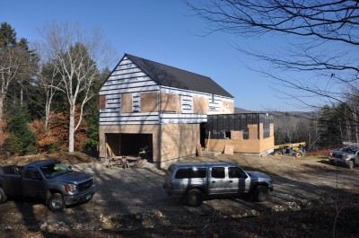
Siding for instance. The lower siding is 1x3 green hemlock, unfinished from a local mill over insect screen over coravent strapping over Solitex mento 1000 building wrap from 475 supply over Vantem Sips..
The Solitex is a beautiful product, black and with UV protection which allows for an open gap siding treatment. I spec'd 1x3 local green hemlock because it is beautiful to work with when green, will shrink and gap in place as it dries and turn gray, The individual pieces are somewhat irregular so the overall effect is like a fabric. Very sexy and at a fraction of the cost of some other wood sidings. Hemlock is a very durable wood when left to weather. When I was a teenager working in a sawmill in Maine we cut a lot of hemlock to build a bridge over the crooked river. I also used it for much of the framing for my barn and I have many staging planks of hemlock. Because it is untreated all waste can be burned as kindling, or even tossed into the bushes to provide habitat for red backed salamanders. The photos show the window holes boarded up in preparation for the coming storm. I was there the day the glorious windows from Unilux were delivered. Next up: installing the windows - a very different affair than the standard American window with flanges.
Chris Corson, a builder in Maine working in the Passive House arena used raw pine in a similar fashion on this neat little project
Modern vs Conservative (neo-traditional)
Just a small thought. Perhaps I should collect more along these lines. "traditional" design (which is usually not actually very traditional) seems to limit one to creating spaces that are "nice" and "pleasant" and "functional" which is enough for some people. But it is hard, especially when faced with a fantastic view or outdoor space, to create a space with amazing emotional impact within the confines of traditional design.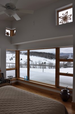
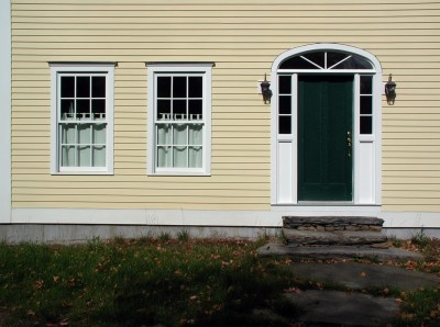
Grassroots Modern, Carpenter Modern
Living in an aesthetically conservative state as I do, I am led to wonder what is it about modernism that scares people? After all, everybody loves their tiny simple I-Pod and their swoopy sleek cars and fancy footwear (except during mud season). Maybe modernism is still stuck with the images of white, cubist flat roofed houses that leak. Perhaps a survey is in order: what does modernism mean to you? As an architect I get to look at many magazines and books that are filled with warm, easy to live in modernist houses with amazing spaces and light but most of these houses are way beyond the budget of normal people. Dwell magazine comes as closest to the mark although they make regular forays into the high end of modernism as well. As a carpenter I realized that most carpenters are modernist at heart though few realize it. What is the simplest, cleanest way of doing something that results in something that works well and looks beautiful? - Actually bicycle design comes to mind here but this is a common carpentery way of looking at things. I use the term “carpenter modern” sometimes to describe the low budget modern aesthetic that I love so much – see my barn in a previous post. True, a lot of modern architecture is sleek and expensive and impossible to live in but great for displaying artwork. But carpenter modern is a grassroots modernism that seems to be about doing more with less and doing it better. Simplify the detailing, make the plan perfect – inside and out. Play with light. Play with views. Work with the seasons. Make the house as energy efficient as possible. Make it as low maintenance as possible. Make it as low budget as possible so you can splurge on the glass tile in the shower or a little more room in the plan for a bigger pantry instead of architectural shingles or fancy trim or gables on gables on gables which the all plan books seem to be full of nowadays. Window placement does not have to be a compromise between inside and outside. When all this is accomplished, then look at making it a cohesive aesthetic package, work the proportions and detailing to perfection. It is okay to do something just because it is cool. Architecture should be fun. Have no regrets when it is built. (Hopefully you get a client who understands the importance of these things because this takes time and time is money.) I like to design houses that people fall in love with. I like to walk into a house I designed with someone who hasn’t seen it yet and watch their jaw drop. I like that moment when someone realizes that this is what it’s all about.
The True Measure of Good Design
I listened with interest and a level of cynicism to an NPR interview of a bunch of high school kids touring the solar decathalon houses on the Washington Mall this summer. They loved the houses, which were clearly modernist in design, and could happily envision themselves living in such a house. I say cynicism because in ten years when they are looking for their first house to buy, I bet they will be looking for something "phony colony" or "neo-traditional"(Architectural anachronisms) in a garage door dominated subdivision. These kids will grow up and get conservative. Or maybe not. I have been encouraged recently to hear that the baby boomer's kids are not neccessarily looking for houses like they grew up in. Green design is in, cool modern aesthetics are in, smaller footprints and better floor plans are in. natural light is important, neighborhood is important and not just for the quality of the local schools. A good measure of design is "would a twelve year old think it's cool?" This works for houses just as much as other forms of design such as automobiles and electronics.
Bob's Barn
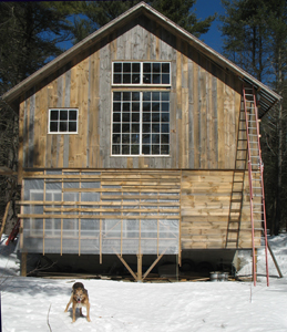 Here is a view of my barn so far. I am gradually building it to house my studio in the loft which will be super-insulated and heated with a wood stove and maybe a solar air heating panel to the right of the big windows. The big windows are out of an old factory and will have to be weather-stripped. I will also add polycaronate interior shutters and a big heavy curtain to draw at night. Downstairs left and center, I covered the studs with a greenhouse poly and I'm putting slatted siding over this with screws. El-cheapo moderist detailing that makes for a beautiful storage room inside.
April 4 note: I have spent $13,600 so far and will probably double that when all is said and done.


