modern

A Smallish House in Massachusetts

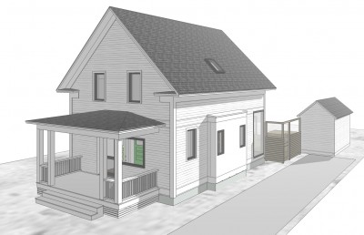
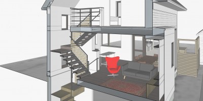
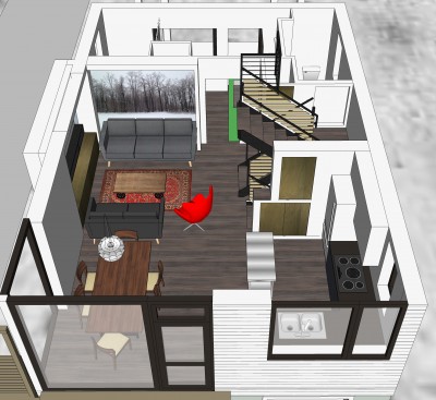
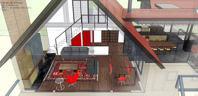
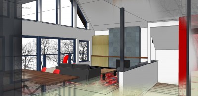
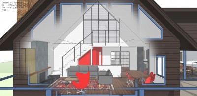
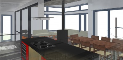
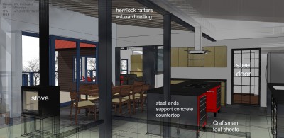
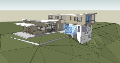
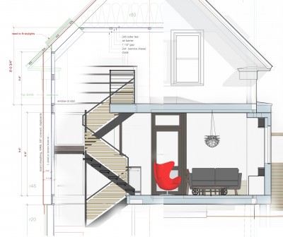
I am working on a 1400 s.f house in Massachusetts. Given that the walls are over a foot thick, the actual square footage is quite a bit less (about 1200). The extra insulation (and cutting edge building science) allows us to forgo a heat system other than a relatively inexpensive minisplit - and monthly fuel bills. Here are a few images of what I'm up to. no fancy rendering for now, just the Sketchup model and some Vectorworks CAD drawings. composite section showing stairs, construction details, interiors and exterior trim

Brattleboro architect Robert Swinburne

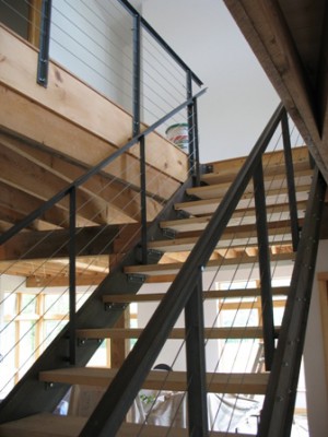
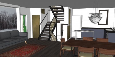
I spent a fair amount of time detailing the steel and wood stairs in Sketchup as I have found that is the only way for me to really figure out every nut and bolt and refine the design to the level that I am comfortable with before construction drawings. I like to approach the stair as sculpture with every piece exact and connections "just so". Thus I am able to design something that is quick and easy to assemble with just the right amount of "fudge space" built in. steel stairs

steel stair design

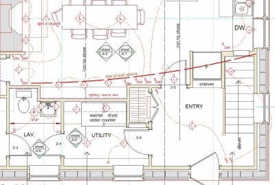
The floor plans have shrunk and simplified from the last version becoming more functional and comfortable.

Floor plans

Mod Ski Home in VT - interiors

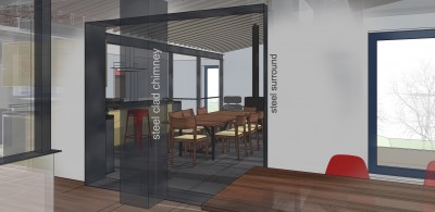
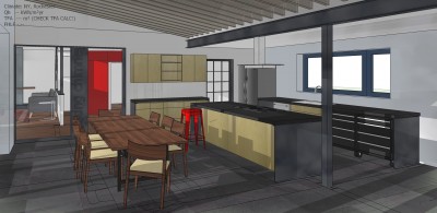
I'm working on fleshing out the interiors for this addition renovation project here in Vermont.

G-Jan-4 from Robert Swinburne on Vimeo.

Southern Vermont ski home addition and renovation in a modern styleSouthern Vermont ski home addition and renovation in a modern styleSouthern Vermont ski home addition and renovation in a modern styleSouthern Vermont ski home addition and renovation in a modern styleSouthern Vermont ski home addition and renovation in a modern styleSouthern Vermont ski home addition and renovation in a modern styleSouthern Vermont ski home addition and renovation in a modern style

Education of an Architect('s wife)

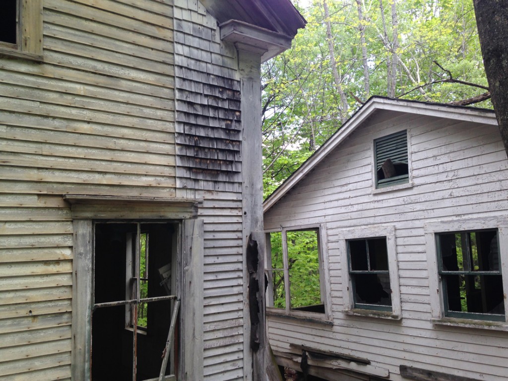
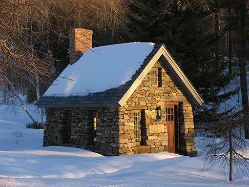
The Day I Became a Modernist—Guest Post by the Architect's Wife There was a time in my life when I would not have uttered the word “modernist” without an accompanying sneer. My aesthetic tastes then ran toward the…dilapidated. If it was old with a sagging roof, I liked it. Bonus points if it looked like it might fall over any minute. I loved dark little stone cottages that probably had little light and abundant mildew inside.

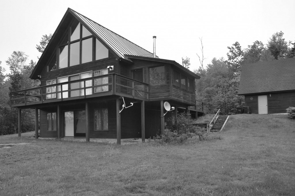
Abandoned house in Harrison Maine No Bob - maybe more like this: Stone cottage but crappier - ed.

When I was a child visiting my grandparents in Chicago, I was bored to tears by the Frank Lloyd Wright tour.

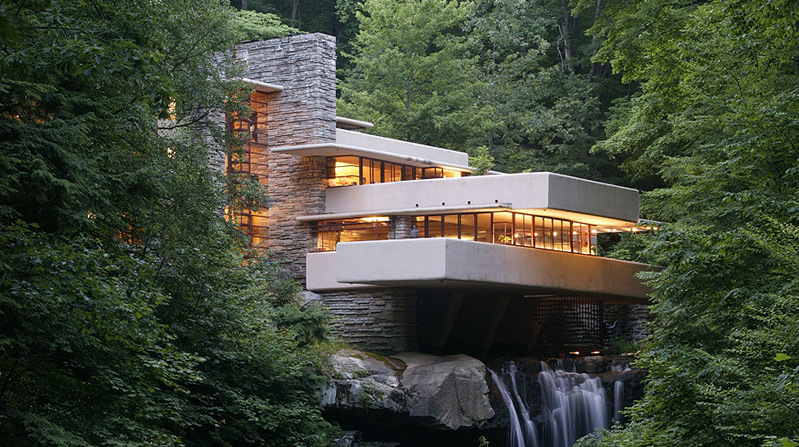
Then I met Bob. Who will describe how he was moved to tears the first time he saw Falling Water. Falling Water by Frank Lloyd Wright

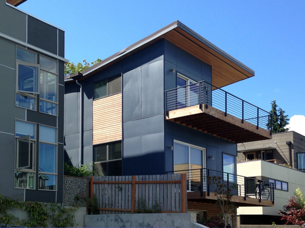
Gradually, from listening to him talk I began to be more open-minded. I realized that much of what I had derided was not actually modernist, but rather the post-modern stucco’d bland that was the hallmark of the late ‘80s gentrification during my teenage years in Seattle. Under Bob’s tutelage, I developed an appreciation for the concept of modernism as something that embraced clean simplicity, elegance in minimalism, form in the service of function. But I still didn’t really like it. Seatlle modern house

The other thing for which Bob helped me develop an appreciation was bicycling. I had not owned a bike since the one I had at age 8 that had pedal brakes and a coveted banana seat. But since he was an avid cyclist, I got a basic mountain bike and began learning some technical skills for riding the trails. I loved riding but rolled my eyes when he would wax eloquent about sleek steel or clean joints or carbon fiber. To Bob, a well-made bicycle is a work of art.

Firefly titantium cycles Boston Massachusetts added by Bob - ed.

About a year and a half into our dating, Bob and I took a trip out West to Seattle (my childhood home), Portland and Northern California. Since one of Bob’s favorite pastimes was (is) visiting bike shops to ogle the merchandise, we stopped at a large shop in Portland. After forty minutes or so I was feeling glazed and wandered to a different part of the shop.

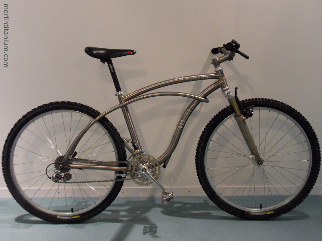
And there, at the end of an aisle, I saw it. It was titanium. It was sleek. It was retro. For the first time, I could understand the urge to hang a bicycle above the mantle. The angels were still singing when Bob found me staring slack-jawed at the Merlin Newsboy. If I recall, he nodded patiently with a knowing smile as I sputtered about how beautiful and perfect it was. That Christmas, he got me a Merlin decal as a joke (the actual bicycle was a limited edition with a price tag something on the order of $3500, and didn’t come in my size frame anyway).

Merlin titanium newsboy mountain bike

By the following Christmas after that, we had gotten married and bought our home together. Browsing through the tool department at Sears, the angels sang for me a second time. Bright red, ball-bearing Craftsman cabinets. Those drawers feel downright sexy, how smoothly they open and close. Open-close, open-close I went as Bob looked at table saws or something. And all I could think was : kitchen utensils!!

Sears Craftsman red tool chest with ball bearing drawers

So I guess that sort of clinched me as a modernist. And I even like the buildings now, too (I challenge anyone to not love weathered core-ten steel cladding). core-ten siding

I suppose fifteen years of living with Bob has rubbed off on me. But I still love dilapidated, too.

Progress on Mod ski home in Vermont

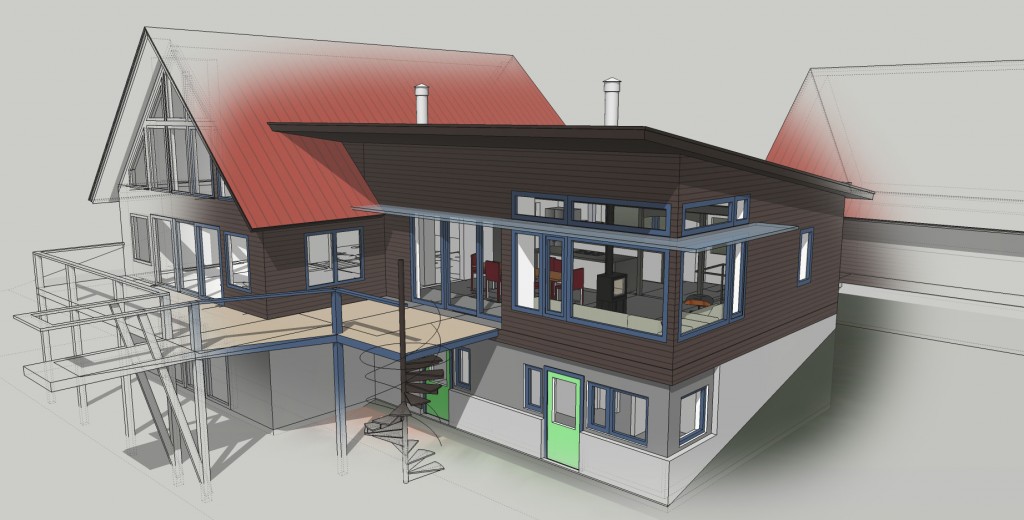
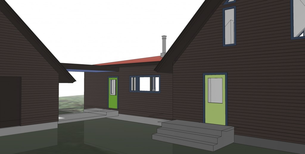
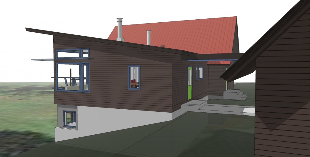
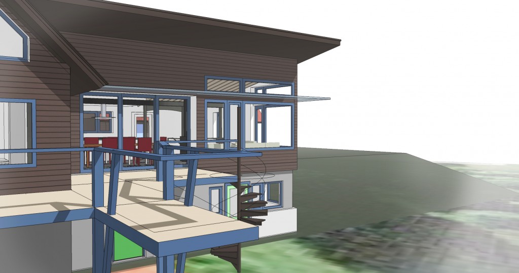
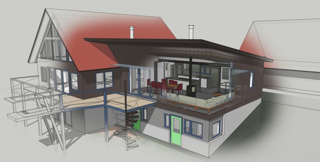
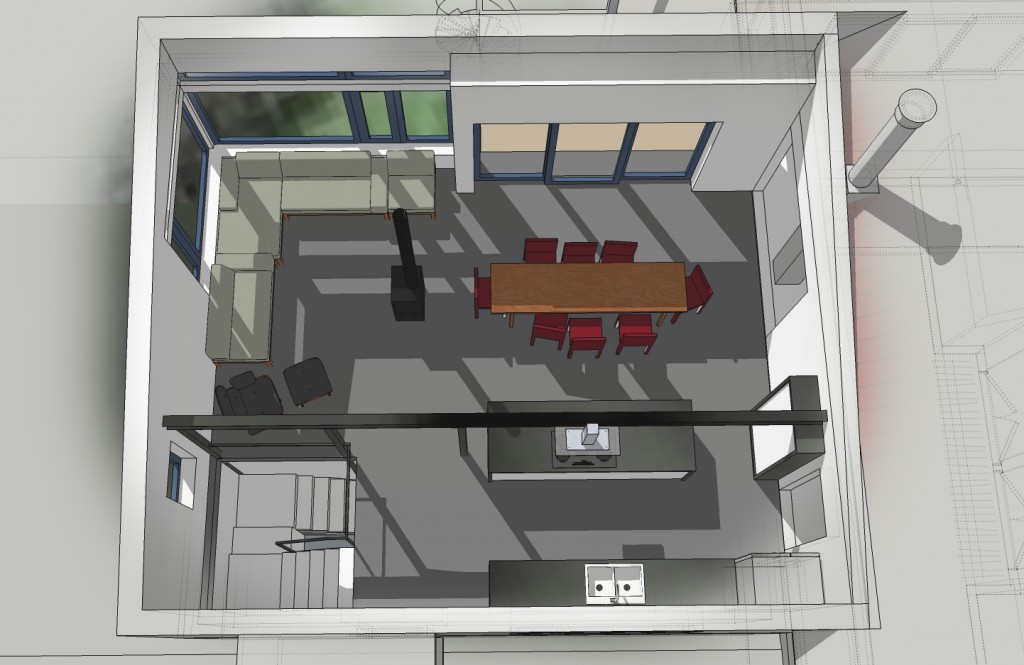
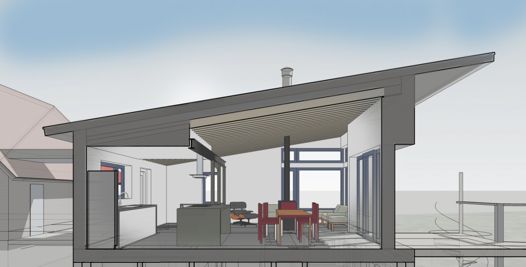
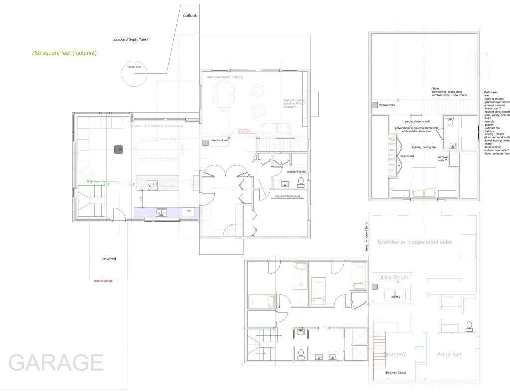
One of the projects I'm working on is an addition to and renovations of a ski home in Vermont. The main house is well built and and other than a maroon and pink bathroom and rather 80's finishes, we are not doing anything too major to it. We are locating a family room addition between the existing house and garage which will provide a much nicer kitchen and living area plus additional bunkrooms and a multi-user bath on the basement level. I'm sticking with the dark clapboard and red standing seam roof of the existing as I think it provides a nice base for some fun things to happen with color at the doors and windows. I am using big windows, wood, steel etc to create a warm, modern and relaxed space for lots of people to be in. Here is the current plan: and I put together a few videos of the sketchup model

Our vacation and train ride across the country - travel log

Every few years we we take a vacation! This time around it was to visit Seattle to say goodbye to my wife's family home which will be razed to make way for a bunch of poorly designed condos. The house is on a double wide lot in the Madison Valley neighborhood. The house itself is a nice little craftsman that would otherwise need a lot of work. The yard is full of plums, figs, apples, kiwi vines, blackberries and assorted other plants so the big sad thing for all of us is losing all that.

The neighborhood is being "gentrified" with new, maxed out square footage modern buildings with, for the most part, only a few token shrubberies.

The last straw causing my wife's folks to sell was when the neighbor's house came down and three new condo units went up, towering over their house. I toured the middle one at an open house and took pictures from the roof deck of the in-law's house. They developer built a retaining wall right up against the foundation of the in-law's house which was, apparently, illegal in this case but happens commonly because the hassle of litigation prevents most people from bothering and the fines for being found "at fault" are less than the profits from doing it in the first place. Apparently this was a utility easement not to be covered.

Seattle has most excellent playgrounds with much "vestibular stimulation" of which I availed myself on a few occasions, resulting in severe queasyness.

Vestibular play from Robert Swinburne on Vimeo.

The neighborhood had much interesting and new modern architecture to look at although Much of it involved gratuitous use of materials and forms (overdone) so I'm currently on modernist overload. Most of what I saw had little relationship to the site other than topography on sloped sites (long stairs outside of buildings) This is mostly because the new buildings were built for maximum square footage on a given lot. There was very little room for green space left over although there was much median strip gardening going on. There is still some pockets of eccentricity and a few green-space holdouts in the neighborhood but I fear that in 20 years, these too will disappear.

Seattle is nice and all. Charlotte poisoned pigeons in the Park (click link for original video of Poisoning Pigeons by Tom Lehrer)

But the funnest part of our trip for me was the Amtrak train ride out there. We Left Albany on an overnight Amtrak train to Chicago to visit Grampa Allen there. Our train was delayed for several hours near Gary Indiana and I shot this video with my I-phone:

IMG 1331 from Robert Swinburne on Vimeo.

I think these are mostly steel mills (?) There were miles and miles of colossal and fantastic architecture right along the train tracks. It was stunning.

There was a very cool thunderstorm in Chicago one night.

Chicago Derecho Storm Video and Time-lapse Highlights - June 30, 2014 from Craig Shimala on Vimeo.

In Chicago we went to the Museum of Science and Industry where Charlotte fell in love with model boats which fit in well with her long standing aspiration to become a pirate.

Here is a view of the back of the museum which is more interesting than the front - Other architects will know what I mean, we are always ducking around back of buildings for a look.

This area of Chicago fascinates me because of the 1893 Chicago World's fair with all the fascinating stories surrounding it (Read Devil in the white city) and all the amazing but temporary architecture.

We then continued on for two days to Chicago along Amtrak's northern route. This led through North Dakota and Montana before reaching Spokane and Western Washington. Our country is very flat in places.

I found it interesting nonetheless and was interested to see the "placemaking" efforts of small homes in the middle of nowhere. The usual tack was to plant trees and in some places you could see a grove of mature trees signifying that a house once stood in amongst them. Some folks planted in a regular and geometric fashion and others much more randomly but in many cases there was nothing at all save a few shells of abandoned buildings.

LOTS of room for wind and solar power.

http://vimeo.com/100851253

Things got hilly once we hit the Cascades.

We flew back to the East Coast at the end of our vacation but that was just a plain old boring plane ride. Although there was a full moon at sunset over Baltimore.

Now I'm back at work and the world didn't end without me.
Photos! Stratton Modern is nearly complete

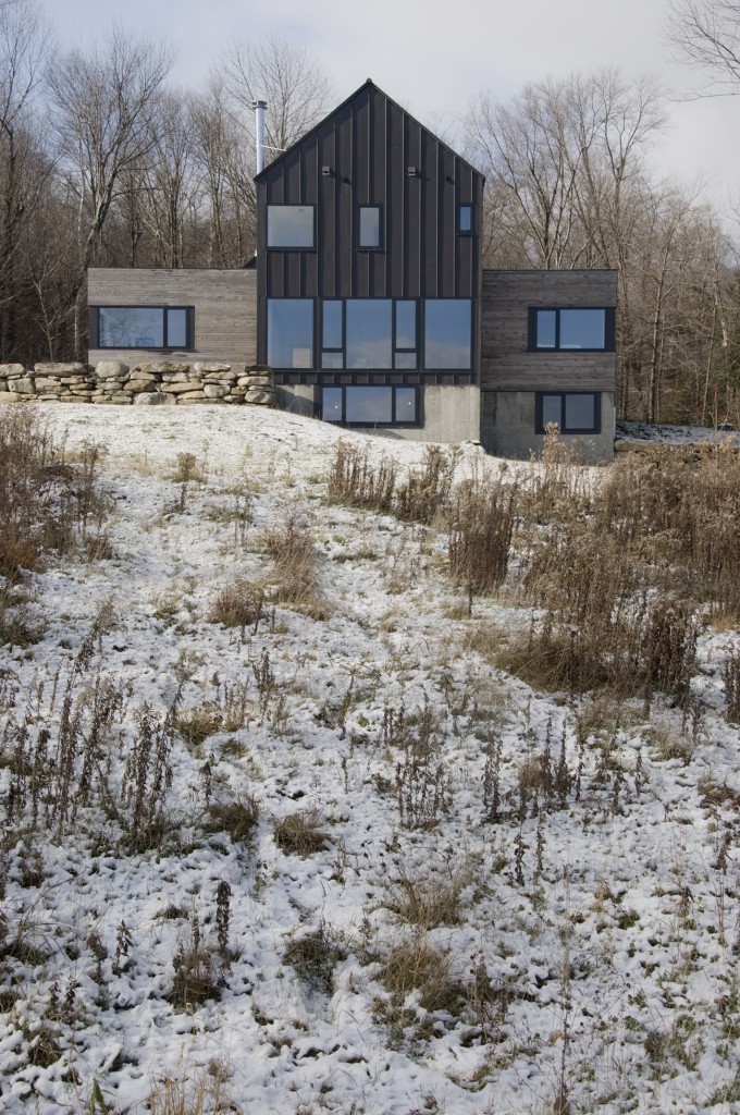
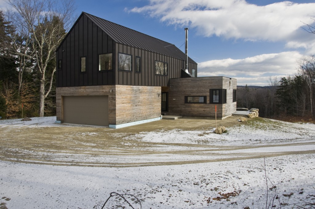
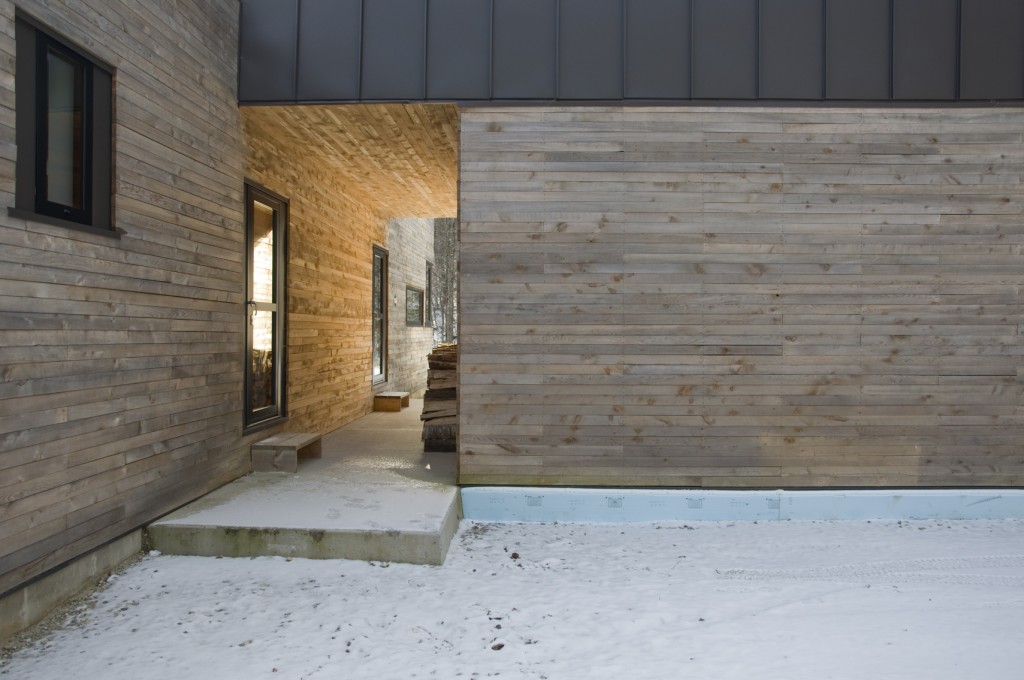
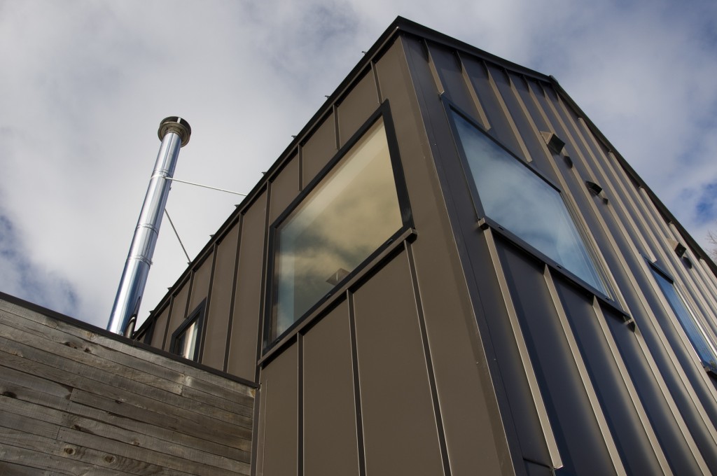
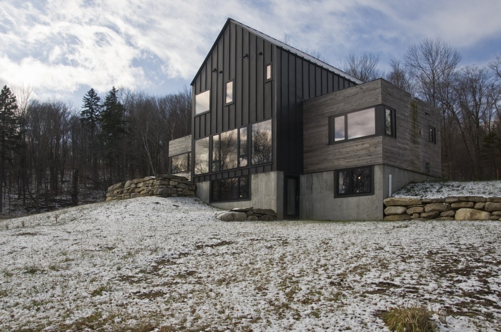
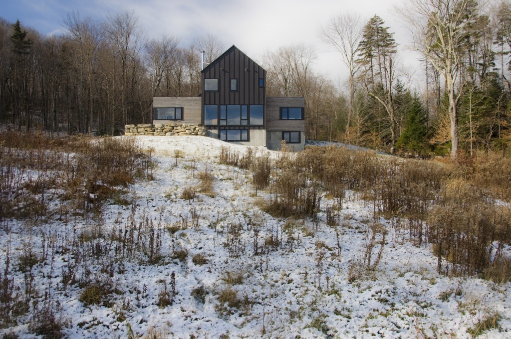
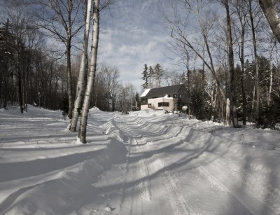
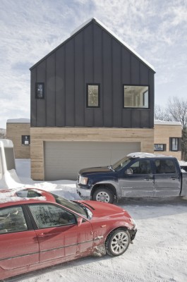
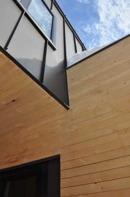
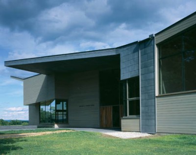
I visited a recent ski home project near Stratton mountain ski area to get some photos. The house is nearly complete. As usual there are things I would do differently next time and things that didn't quite follow the drawings but that's for me to know and no one else to notice. I really like the "presence" of this house. The coloring and materials are first rate. It is very "touchy feely" and very responsive to the changing light as the clouds raced across the sky. I can't wait to do the local, green hemlock over Solitex Mento again. and better. Click on the photos for big screen enjoyment.

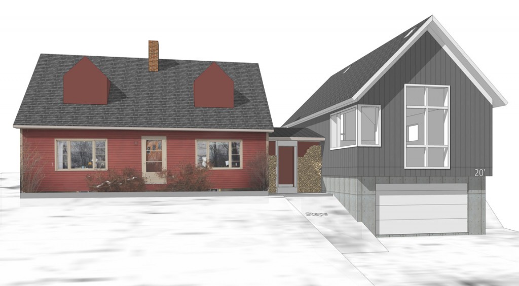
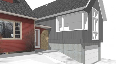
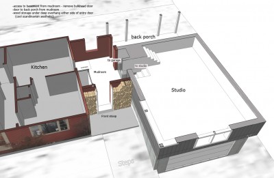
Schematic for Studio over garage and mudroom addition

Some images from the model. Of course I don't think the clients can afford it but it's a good starting point. This is a one car garage with a studio space above it, a rear yard screen porch and a mudroom connecting all these. We can treat the addition as a separate unit from the existing house itself by building it to passive house standards and heating it (and cooling it) with a simple mini split heat pump. or we could ignore the cooling aspect and use a very small amount of electric heat.

Stratton House Progress Report for January 2013

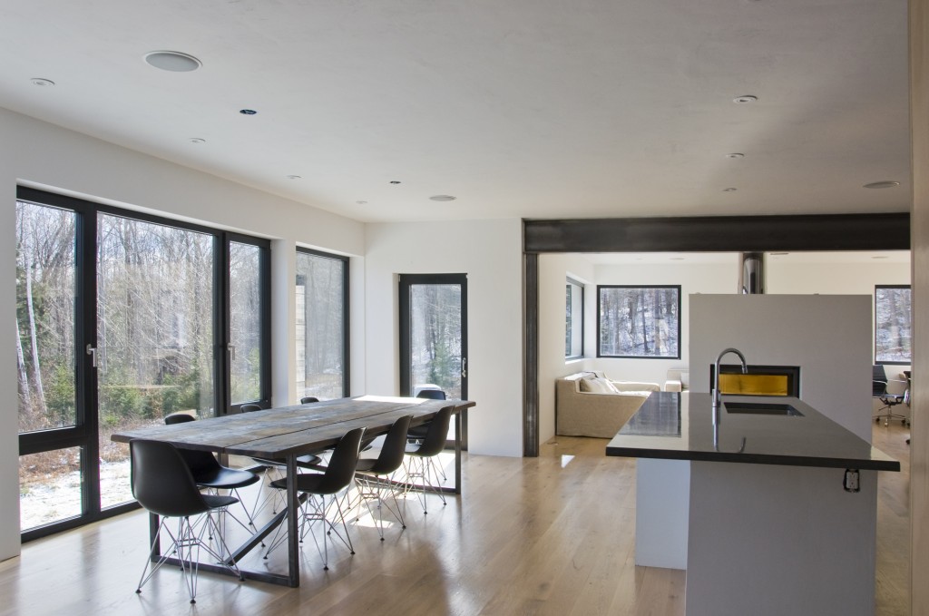
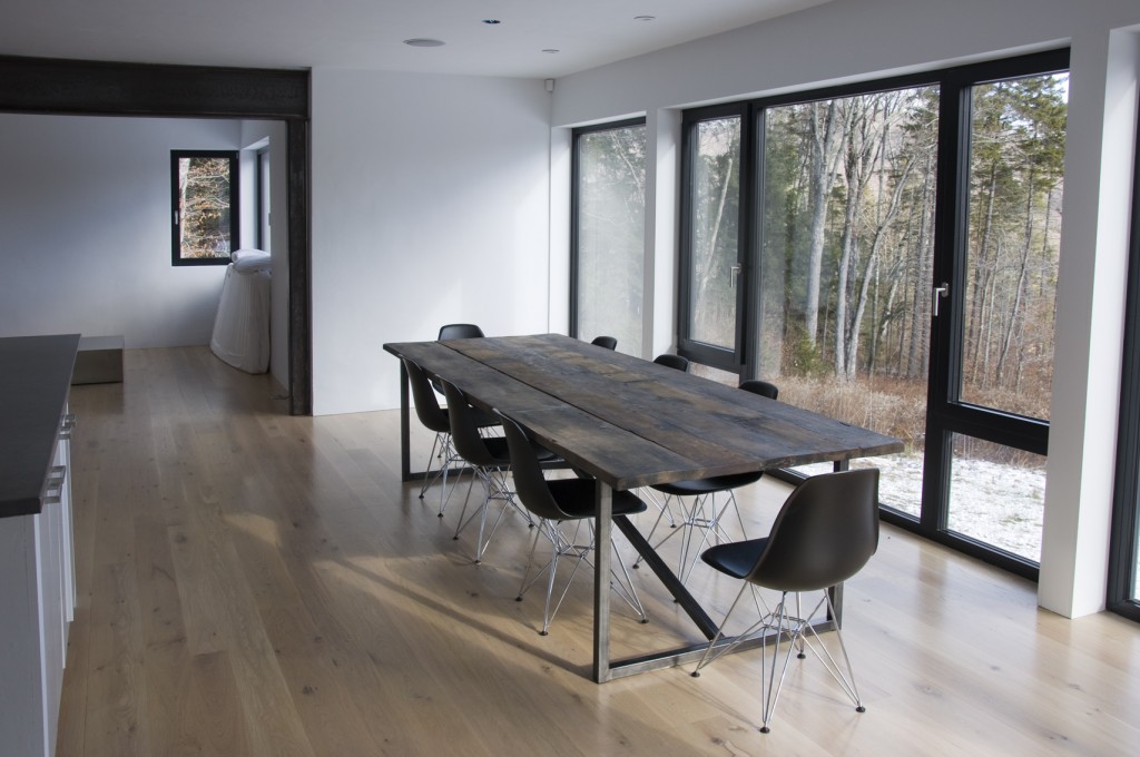
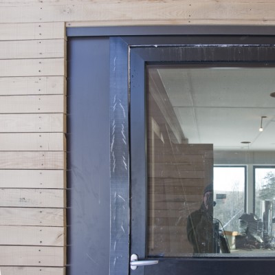
I visited the Stratton Project the other day to see how things were progressing. Flooring is going down (locally milled white oak) and plaster is going up. I'm very happy about the decision to plaster the walls on the main floor. The whole house inside and out is turning out to be a very tactile thing. The (experimental) rough hemlock siding on the exterior will weather to a soft grey and has the appearance of fabric, the plaster has just enough texture to do wonderful things with light in a way that a painted wall simply can't and the raw steel structural beams and posts provide a beautiful space defining element. The steel siding is actually "midnight bronze" which means it has a lot of color depth and can appear black in low light and shadow but really bursts forth in bright sunlight with the bronze undertone. Houzz.com has a lively discussion of black houses going on right now and lots of very strong opinions are being expressed! I have always loved black and dark houses. The more monochromatic the better. It speaks to the kid in me - I expect something more exiting from a dark house in a monsters under the stairs and witches in the attic way. With a modern looking project like this it's always interesting to see what the folks who work on it say. Some are completely sold and others not so much.

I completed Passive House Designer training after the design of this house and with my new level of knowledge of super-energy efficient construction, I would have done a few things differently perhaps but not much. At some point I will complete energy modeling on this project to see how close to the passive house standard we go.

Over the next few months the interior should be completed and I will post photos as things progress. The outside will look good for a while, then the snow will melt and it will look crappy until site work is completed.

Green Hemlock Siding on a Modernist house in Vermont

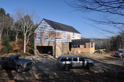
Construction is underway on this super insulated modern house in Vermont where we are trying out some very cool things. stratton house SW

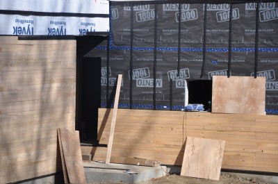
Siding for instance. The lower siding is 1x3 green hemlock, unfinished from a local mill over insect screen over coravent strapping over Solitex mento 1000 building wrap from 475 supply over Vantem Sips..

lower siding treatment for Stratton house

The Solitex is a beautiful product, black and with UV protection which allows for an open gap siding treatment. I spec'd 1x3 local green hemlock because it is beautiful to work with when green, will shrink and gap in place as it dries and turn gray, The individual pieces are somewhat irregular so the overall effect is like a fabric. Very sexy and at a fraction of the cost of some other wood sidings. Hemlock is a very durable wood when left to weather. When I was a teenager working in a sawmill in Maine we cut a lot of hemlock to build a bridge over the crooked river. I also used it for much of the framing for my barn and I have many staging planks of hemlock. Because it is untreated all waste can be burned as kindling, or even tossed into the bushes to provide habitat for red backed salamanders. The photos show the window holes boarded up in preparation for the coming storm. I was there the day the glorious windows from Unilux were delivered. Next up: installing the windows - a very different affair than the standard American window with flanges.

Chris Corson, a builder in Maine working in the Passive House arena used raw pine in a similar fashion on this neat little project

What would Bob do?

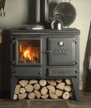
I have been asked before: If I could start from scratch with a decent budget, what sort of a house would I build for myself? I was thinking about that the other day as my eyes wandered up to the huge pine and maple trees that tower over the house (mental note: check homeowners policy) That is a tough question to answer. Part of me would live to live in a big old farmhouse and part of me wants a Tom Kundig sort of house with lots of steel, glass and concrete and a cool device that does something interesting. The reality may be somewhere in between. Living where I do, energy efficiency and insulation rule out either of these options in their pure form. But there are lessons to be learned from both extremes. My own tastes probably run toward a warm modernism with Scandinavian influences that isn't afraid of wood and stone as well as glass and steel. I would not impose the limitations of “traditional” architecture on myself. I've seen too much for that. I'm spoiled. I like light and dark, open spaces and well defined spaces. Indoor and outdoor. I don't like to take my shoes off whenever I come in the house. Function rules! I like porches. I like woodstoves.

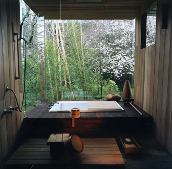
I like low maintenance. I like simplicity. I want a huge range in the kitchen and a huge island to match. I like old fashioned pantries - with a window. I like when a window goes down to the floor. I want laser cut steel switchplate covers. I like wood ceilings and floors but not wood walls. I love dark slate with dark thin grout lines. I don't like big bedrooms. I want a soaking tub. I dislike fancy. I hate frippery and fakery! (fake divided lite windows make me gag) Sometimes I use the term “carpenter modern” to describe my tastes. There is a lot of this in VT. My own barn is a good example. It describes a building or house or detail that does the job without any overt nod to “style” but in its simplicity and function and logic, it becomes beautiful. Did I mention that I love raw steel? It is difficult for me to find examples of what I like in print media. Everything is too big, too fancy, too complicated, too precious. Dwell Magazine does a better job of presenting "real people" type projects. And I love looking at what happens down South at Auburn U's Rural studio If I were to design my own home, it would probably kill me.

The Home Office

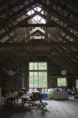
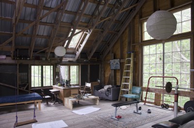
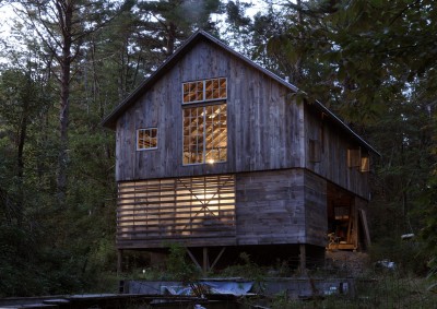
I often work at home when I really need to get things done. With a 900 s.f. house there isn't any place but the kitchen table most of the year but when summer comes, I get to work out at my big oak desk in the barn loft. There is no cell phone signal and no internet but I do have a land line. I am able to focus incredibly well in the barn and I often listen to previously downloaded podcasts of books from Librivox or I simply listen to the wind and the birds. Occasionally my daughter invades the space to play with toys or swing on her swing. I built the barn myself over several years with pine from our woods and hemlock framing from Kerber Lumber, a local mill. barn loft work desk in the barn loft

Bob's barn exterior evening image

Angles and Curves

I was recently sent a “suggested” floor plan for a renovation project that gave me a good laugh. It was for an old house where rooms opened to each other gracefully and the back parts of the building (not original) contained hallways and many smaller rooms. There was not a big budget. The plan I was sent took out many walls and added lots more but at 45 degree angles. It was very 80's (roll out the white carpets and sectional sofas, modern floor lamps (shining up) and, of course, the track lighting with huge cans!) If I were a professor in architecture school, having a bad day and feeling the need to be mean I would have said that the plan was amateurish, complicated, ungraceful and expensive. However, I am not an architecture school professor, I am not mean and I never have bad days (and I never lie?) So I ignored it.

But it got me thinking, and writing... so here goes.

Angles and Curves.

When I deviate from the orthagonal I need more reason than just to be cool (for the non-architecty sorts out there that means when I use angle and curves). There has to be a functional reason and it has to solve a problem rather than introduce new ones or simply add cost. Ideally it adds a layer of sophistication and elegance to the spatial and emotional feel of a place. Ideally it introduces opportunity. And it's nice when it can actually save money as well.

This modern project has much more overt angles than I normally go for but site constraints and preexisting conditions suggested the design solution. The overall project was more than usual, an exercise in problem solving. Angling the stair opened up the floor plan in a way that made better use of space and eliminated potential tight spots. It looked cool too. The gentle curve in the wall adjacent to the stair was part of “easing up” of a potential tight spot. It softens the harshness inherent the angle of the stair. (and it looks cool too)

steel stair plan + curved wall

This renovation project has an upper level curve that is not immediately obvious. It eliminates a deep, dust collecting spot over some built-in cabinetry by filling in that space. It creates a nice pattern effect with the morning sun through the large adjacent windows and adds a graceful complexity to the space - the curve is apparent from some perspectives but not so much from others. It softens and relaxes the space. I have no idea if there are any acoustic effects.

In this project I introduced a matching pair of curves in the hallway to ease a tight spot without having to expand the overall footprint of that section of the house. It also provides a unique point of reference for a long hall in a large house. Sometimes in a large house with many straight walls at right angles to one another, a subtle angle or curve can ease up the rigidity of a plan and allow a house to feel more comfortable.

curves in upstairs hallway

Mental note: Something similar can be said for introducing a bit of asymmetry in a strongly symmetrical composition – have I written about this already?

Here, a gentle curve allows the entry hall to reference the door to the garage more comfortably and allows the hallway to end less awkwardly and even with a bit of grace. Sorry about the poor quality of the photo – I need to get back for finished photos. I could see that this curve could have a nice emotional effect and I was glad to see it carried out by the contractor during construction. Sometimes on projects where I have less involvement during the construction phase the builder, not understanding a curve or angle will try to “simplify” the job and convince the owner not not do it. Usually this does not have a ruinous effect but it saddens me to see the loss, knowing what could have been.

One last image - the angled wall at the bedrooms was straightened in construction and the bridge has not been built yet. There are some uncomfortable spots now but it still basically works . The built result is more static and less dynamic than it could have been. Which nobody will notice but me.

Putney School - continuing education

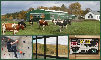
Last night I attended a tour at the Putney School in nearby Putney VT to get some continuing education credits and to see some of the new buildings from their architect's perspectives. The tour itself was rather slow but having my daughter with me for the first half hour livened things up a bit. She may attend that school when she is older as my town has school choice after 8th grade and the school has an excellent network of x-c trails nicely groomed in the winter. There were no local architects in attendance other than Joe Cincotta and my friend from college who work up the river at Bensonwood. Boy do I not fit in in a group of older white male architects with the occasional shiny and polished female architect. I really must get some rectangly glasses. Are there any local architects anymore? It seems like all the good work is scooped up by firms from up North. In any case, the Putney Field house is a net nada, LEED unobtainium building that is very nice on the inside (I want one) but rather dull looking on the outside. I just really wanted to grab a basketball and shoot some hoops. There was a ski waxing room however and some Concept II's.Putney Field House

I really like the Michael S Currier Arts center. Michel S Currier Center at Putney School This a modern building that exudes grace and elegance..and it works well too. Details are nicely worked out on a level from the overall to minute details. The hot link is to a bunch of photos on the Putney School website. This is the sort of building that makes me wish I worked for a larger firm doing institutional and commercial projects. It is very difficult to get this sort of work when you are an anti social sole proprietor lone artist sort who spends all day staring at a computer and muttering.

Budget modern steel staircase

Hey all you sleek expensive modernist architects with square toed shiny shoes and funny little glasses! Check this out. I designed this very cool steel stair out of stock pieces of steel - two C-channels and a bunch of 1 1/2" steel angle. Lots of nuts and bolts. Add some stainless steel cable with turnbuckles and there you go! Very Erector Set. No Welding. When it is completed there will be a wooden handrail bolted on and the 2 x 12's that were bolted in place during constructin get replaced with solid planks of cherry from a tree felled on site. I love the rich patina of raw steel.

see also Stair Porn for a larger photo

Plans are available for this $150. See http://swinburnearchitect.com/wordpress/?p=286