I was recently sent a “suggested” floor plan for a renovation project that gave me a good laugh. It was for an old house where rooms opened to each other gracefully and the back parts of the building (not original) contained hallways and many smaller rooms. There was not a big budget. The plan I was sent took out many walls and added lots more but at 45 degree angles. It was very 80's (roll out the white carpets and sectional sofas, modern floor lamps (shining up) and, of course, the track lighting with huge cans!) If I were a professor in architecture school, having a bad day and feeling the need to be mean I would have said that the plan was amateurish, complicated, ungraceful and expensive. However, I am not an architecture school professor, I am not mean and I never have bad days (and I never lie?)
So I ignored it.
But it got me thinking, and writing... so here goes.
Angles and Curves.
When I deviate from the orthagonal I need more reason than just to be cool (for the non-architecty sorts out there that means when I use angle and curves). There has to be a functional reason and it has to solve a problem rather than introduce new ones or simply add cost. Ideally it adds a layer of sophistication and elegance to the spatial and emotional feel of a place. Ideally it introduces opportunity. And it's nice when it can actually save money as well.
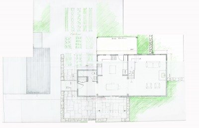
This modern project has much more overt angles than I normally go for but site constraints and preexisting conditions suggested the design solution. The overall project was more than usual, an exercise in problem solving. Angling the stair opened up the floor plan in a way that made better use of space and eliminated potential tight spots. It looked cool too. The gentle curve in the wall adjacent to the stair was part of “easing up” of a potential tight spot. It softens the harshness inherent the angle of the stair. (and it looks cool too)


This renovation project has an upper level curve that is not immediately obvious. It eliminates a deep, dust collecting spot over some built-in cabinetry by filling in that space. It creates a nice pattern effect with the morning sun through the large adjacent windows and adds a graceful complexity to the space - the curve is apparent from some perspectives but not so much from others. It softens and relaxes the space. I have no idea if there are any acoustic effects.


In this project I introduced a matching pair of curves in the hallway to ease a tight spot without having to expand the overall footprint of that section of the house. It also provides a unique point of reference for a long hall in a large house. Sometimes in a large house with many straight walls at right angles to one another, a subtle angle or curve can ease up the rigidity of a plan and allow a house to feel more comfortable.

Mental note: Something similar can be said for introducing a bit of asymmetry in a strongly symmetrical composition – have I written about this already?
Here, a gentle curve allows the entry hall to reference the door to the garage more comfortably and allows the hallway to end less awkwardly and even with a bit of grace. Sorry about the poor quality of the photo – I need to get back for finished photos. I could see that this curve could have a nice emotional effect and I was glad to see it carried out by the contractor during construction. Sometimes on projects where I have less involvement during the construction phase the builder, not understanding a curve or angle will try to “simplify” the job and convince the owner not not do it. Usually this does not have a ruinous effect but it saddens me to see the loss, knowing what could have been.


One last image - the angled wall at the bedrooms was straightened in construction and the bridge has not been built yet. There are some uncomfortable spots now but it still basically works . The built result is more static and less dynamic than it could have been. Which nobody will notice but me.

