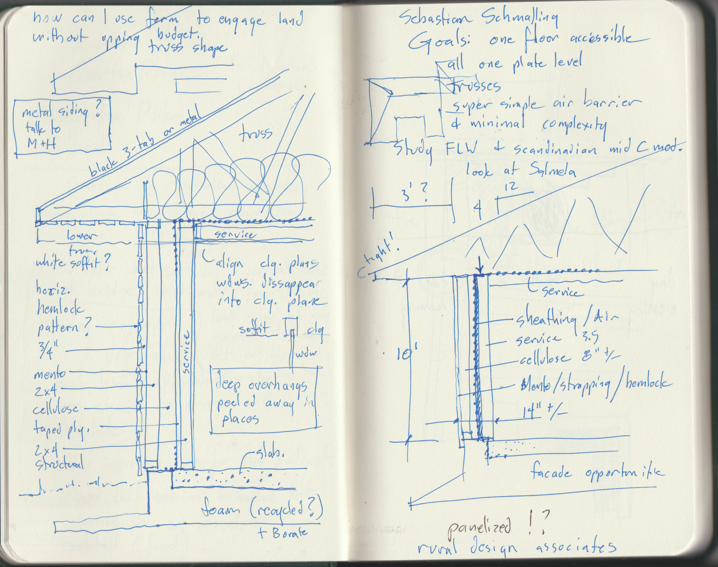
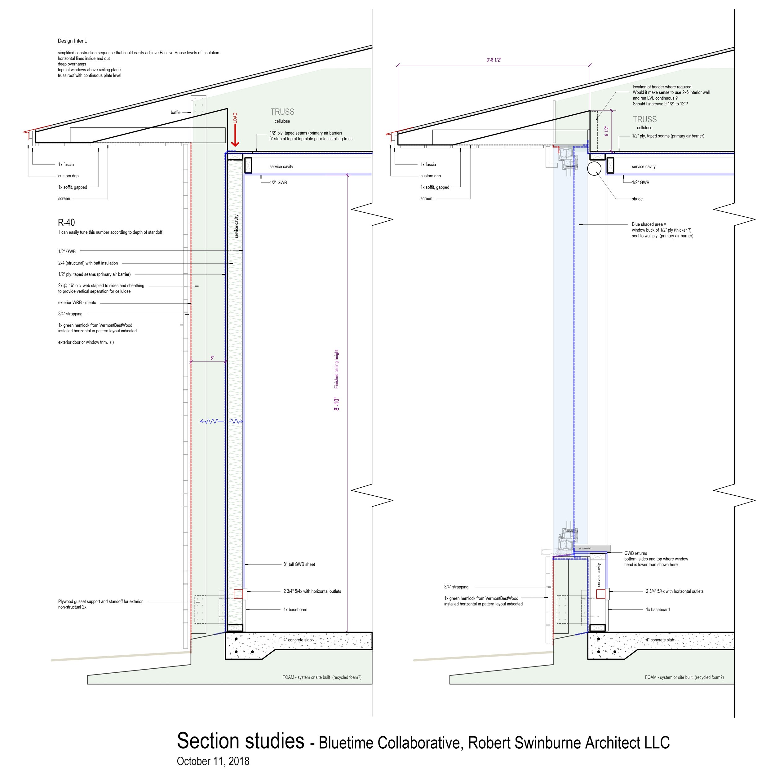
I have been engaging on Instagram much more than on my Bluetime Collaborative facebook page. Recently, I posted a wall section detail that has been germinating in my gray matter for a bit (ew gross!) and subsequent to posting and engaging with all the commentators I realized a few things that may be of interest here on the blog in a more elaborate “mutterings and musings” format.
There are two parts to this post - Engagement and Process. hm…which should go first?
PROCESS! Architects are taught to start with the big picture and work towards detail. I have often rebelled against that teaching. Rebelled may be too strong a word though. A project starts with an inspiration and for an upcoming project (perhaps a few) My impressions of the site and client suggested an overall form and aesthetic which is still only in my head….stewing.
The overall form and aesthetic approach led me to think about construction methodology which led me to start sketching wall sections which led me to realize the sketches were rich with possibility to inform the overall form and aesthetic (I don’t like to use the word style - subject for another blog post) I was at a most excellent symposium last week - AIAcran listening to a speaker and looking at the work of a high end residential firm that does very beautiful work. Check out JOHNSEN SCHMALING ARCHITECTS
I was thinking about how I could achieve some of the desired spatial effects and smooth detailing on much lower budget projects. I started sketching.
A plain old 2x6 wall with fiberglass batts just doesn’t cut it anymore and doesn’t meet code here in Vermont. This simple sketch presents amazing possibilities for creativity! Simplicity and Soundness of detailing is something of a mantra for me and I try to achieve this through early engagement with the chosen builder. Builders LOVE to talk wall sections and each builder will bring an entirely different perspective. There are some excellent products out there and many ways to do things correctly but as an architect, I have to listen to the builder who is actually going to be pounding the nails. A set of products and way of doing things may be perfect for one builder but beyond the comfort level of another builder. Most of the builders I work with are willing to experiment and are also very much into upping their own game but only to an extent. So it is a conversation to have early on in the design process.
There are three big ideas in the sketch above that are apparent to me along with a host of smaller ones.
Big idea #1 is the level of simplicity which is tied with cost/benefit. Us hip building science-y architects and builders are always trying to find that golden ideal of combining Passive House levels of insulation with ease of construction and minimal added cost. I realized that this section represents a basic approach that can be adapted from code minimum (the worst performing house you can legally build) all the way up to full-on Passive House levels of insulation with minimal additional labor or materials. Air sealing is considerably simplified relative to most approaches I have seen or tried. As I write this I am realizing that, with wide overhangs and the window head so close to the soffit, drip flashing at the head of the window becomes less important and perhaps I can even eliminate it altogether.
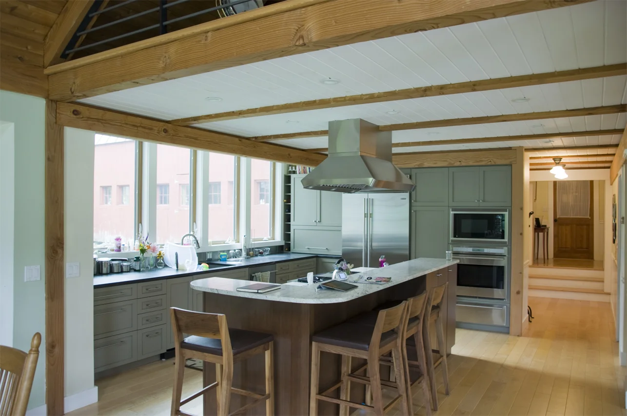
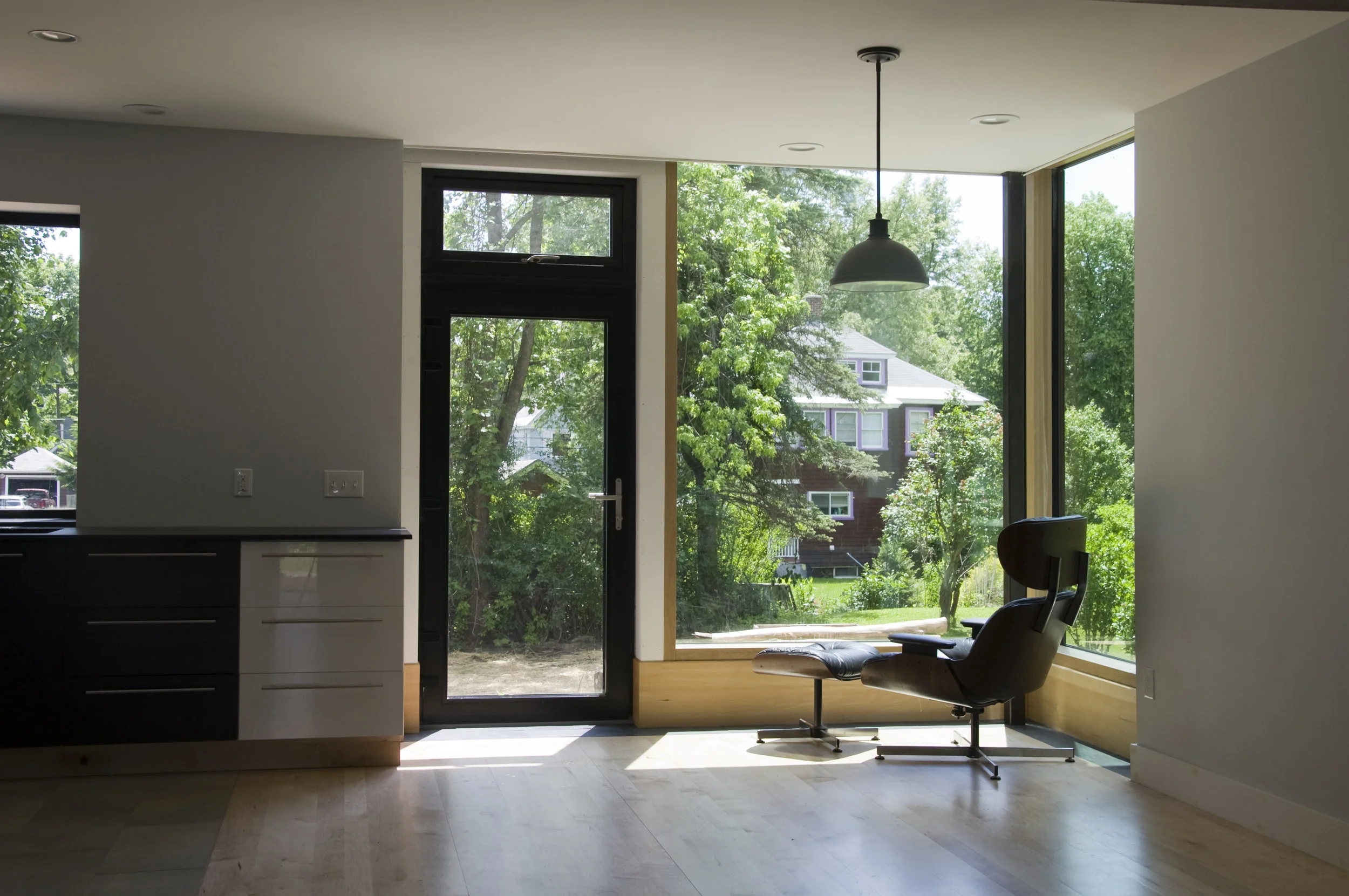
Big idea #2 is that this section allows me to easily do one of my favorite details which is to bring the top of the window above the ceiling plane for any Very Large Windows I might incorporate. I have used this approach in the past with great success in terms of how it makes the interior space feel. It also allows a roll down shade to be hidden nicely. A few examples:
This was a renovation. I added a bump out bay for the kitchen and brought the ceiling plane in the bay above the existing ceiling level. the effect over the sink was similar to a skylight.
High performance houses with thick walls have an amazing psychological effect of sheltering but it needs to be balanced with a clear and strong connection to the outdoors for maximum effect and livability.
Here is an even more dramatic application of this idea by Rural Design Architects on the Isle of Skye - check them out! I love their work.
photography: copyright Andrew Lee / Rural Design
Pleated house by Johnsen Schmaling Architects
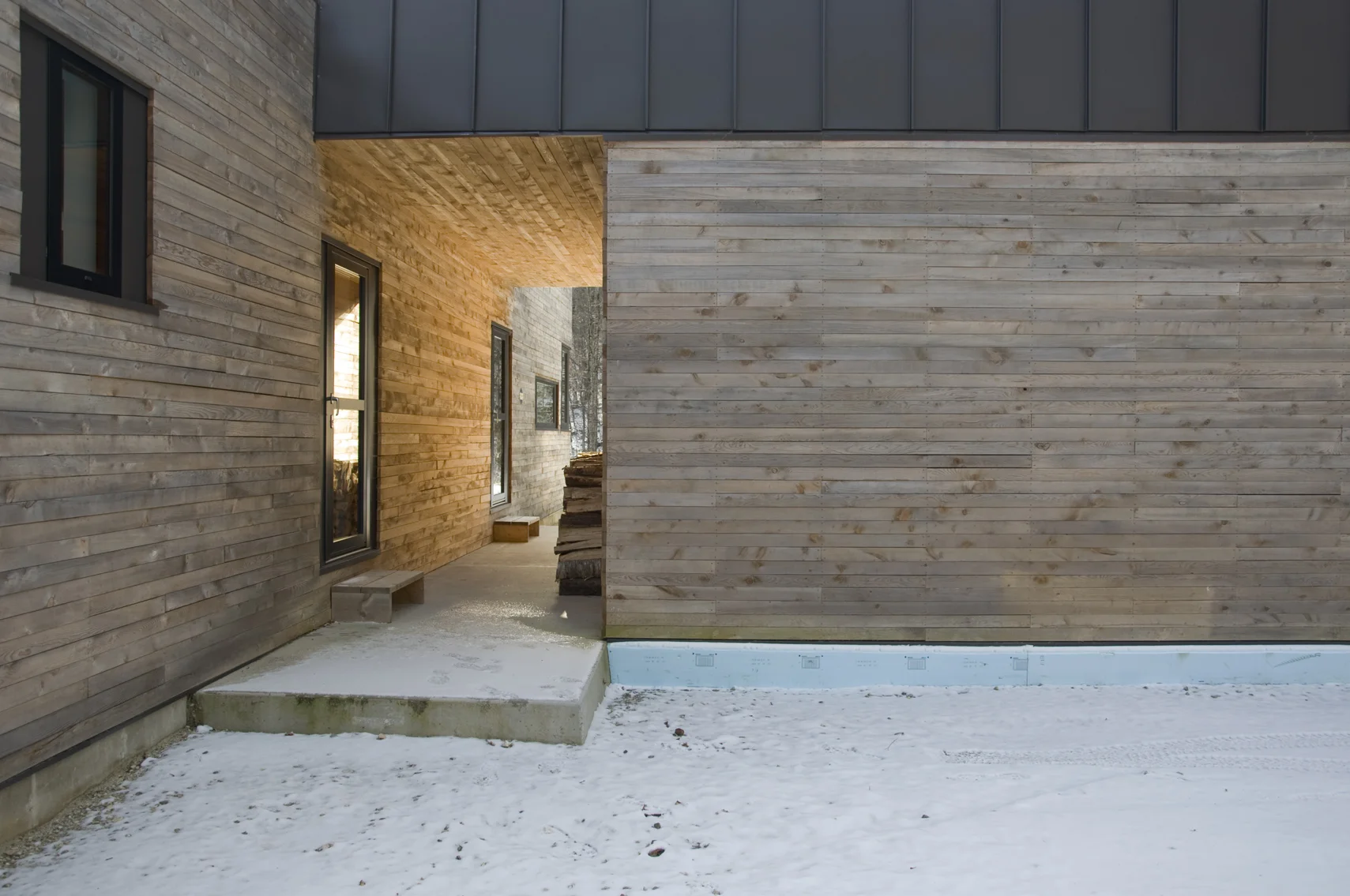
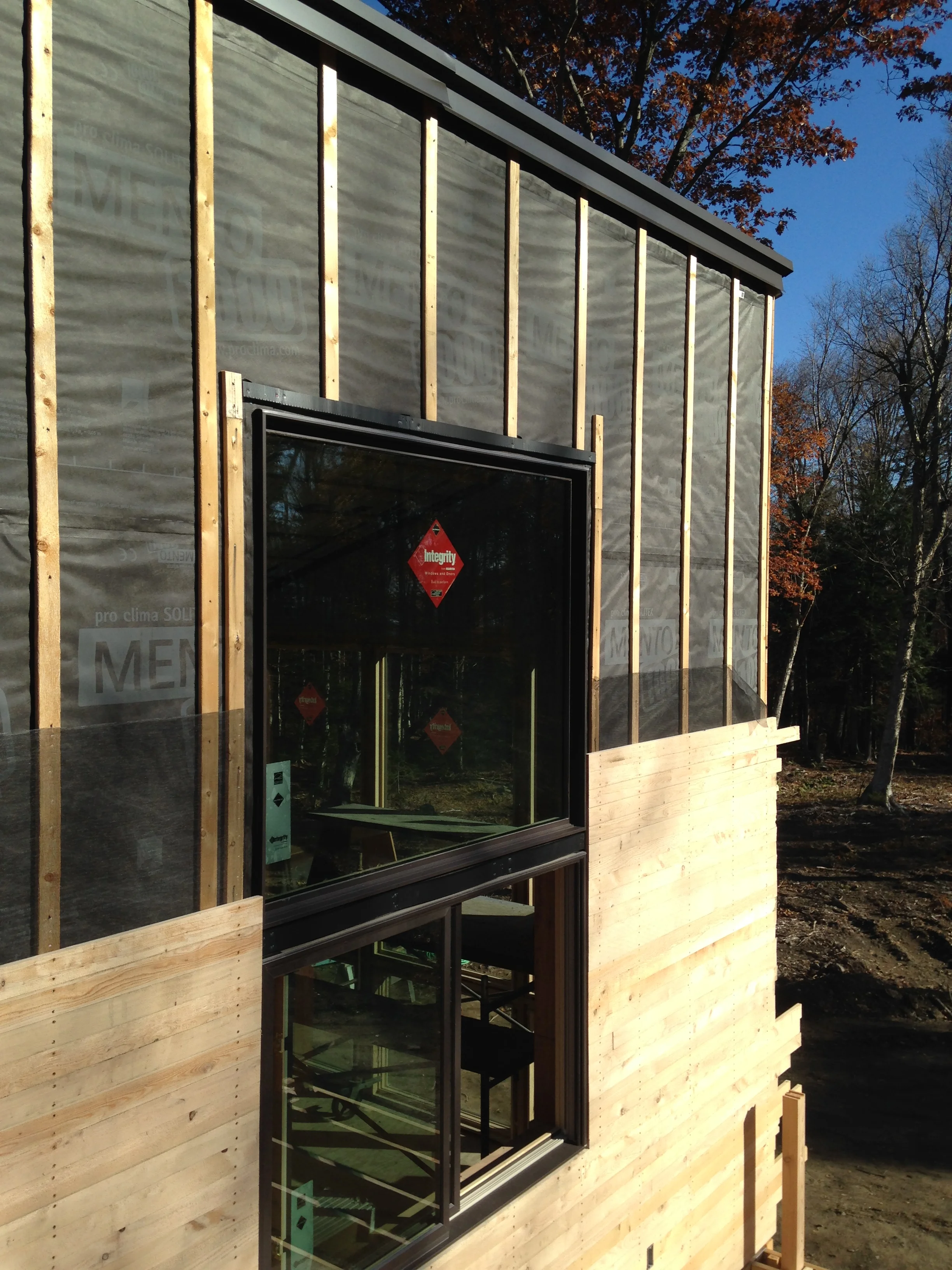
Big idea #3 Needs more photos to elucidate my point (note to self: photograph more of my own work!) I have been refining a siding type over the past 8 years that uses locally milled green hemlock - green meaning not dried either in a kiln or stacked outside for a period of time - in a horizontal rain screen application with no coating or treatment. The details around windows, doors, corners are minimal and easy. The aesthetic is lovely and textural as well as contextual in many rural locations. the cost is lovely too. This is the subject of another blog post once I obtain more photos of the houses where I have tried it. Here is the first house I used this detail on. It weathers to a soft gray This is about 6 months in:
Installation over rainscreen and Mento weather resistant barrier from FourSevenFive.com
Now we get to ENGAGEMENT
As I mentioned above, builders love to talk wall sections. Using social media as well as my network of like minded builder and architect friends, I put the initial sketch “out there” People engaged and asked questions and perhaps even learned things from the ensuing conversation. Which led to a refinement of the detail which led to even more engagement with questions, suggestions, resources for me to check out and perhaps some people learned even more. I did.
This level of engagement is relatively new to many of us and represents a huge opportunity to learn, improve our knowledge, become inspired, meet new people, network, educate, and even market what we do. I am humbled to be part of such an open source community. I know that others within that community are equally excited and ready to learn and share knowledge.

